Design

DESIGN TRENDS: Winter collection

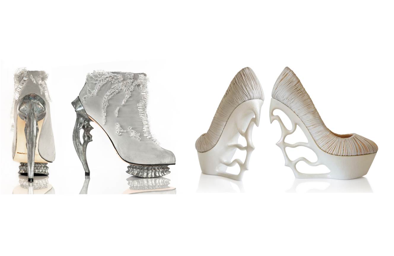
We’d like to share this work of art as an example of an intellectual trend of our current times rather than a fashion trend. Shoes are an everyday item but in Radevich’s world they are a canvas for profound expression.  This shoe collection is an amazing accomplishment that transcends the fashion and design world. By compiling intense amounts of information in a sculpture of an item that already has a purpose, Radevich seeks to ‘define our walk through life’. This diligent and optimistic designer sculpts shoes to state a global problem, a historic account, or a personal message.

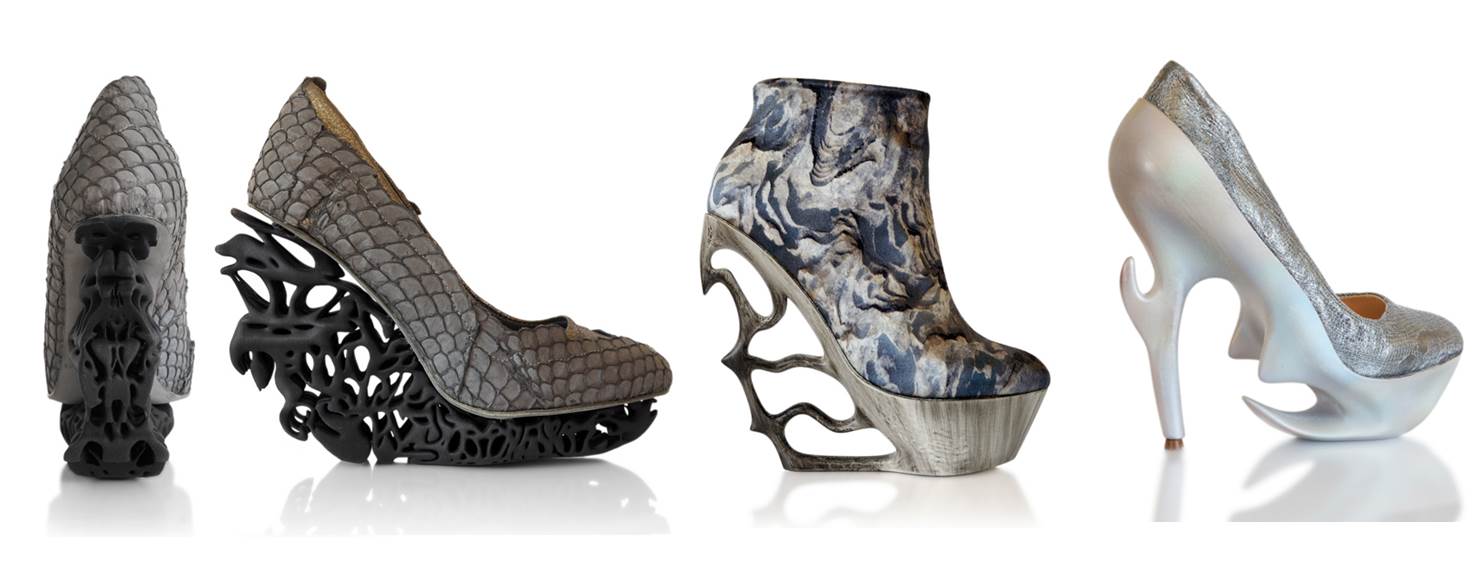
As a history lover inspired by ancient historic accounts, Anastasia Radevich native of Belarus devised a collection of feminine shoes remembering lost cities of the past. Her confident designs comment on the decaying of our environment and reflect on the current threats to planet earth, and hopefully instill a proactive view on the future state of the world.

We interviewed Anastasia to get an expanded view of her collection and this is what she said

What did it take to discover the possibility of bringing your true expressions as an artist into your passion for shoes?

I grew up in a family of shoe designers and experimented with shoes since childhood. Shoe craft became a canvas for ideas because it is something I know very well.

What inspired you to do the "Lost Civilization" collection in 2012?

The Lost Civilizations came to me as a wave of already accumulated ideas and world vision. For quite a while and until today I am keen on philosophy, history (narrated from different angles), anthropology and have noticed patterns how civilizations grow and descend, also investigated the “untraditional” story behind Egypt and the real timeline of the history and evolution. It wasn't hard to draw some parallels with modern state of things. And based on the research I came to the conclusion about the coming future J  All those ideas were brought into the collection…

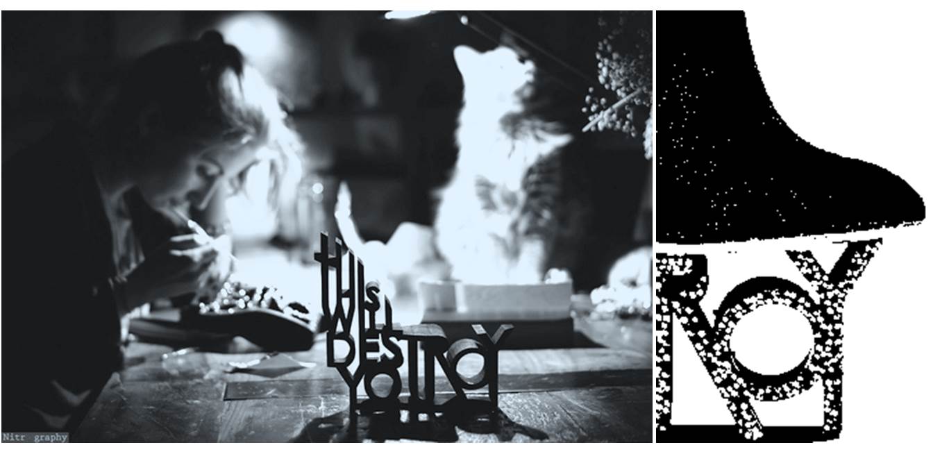
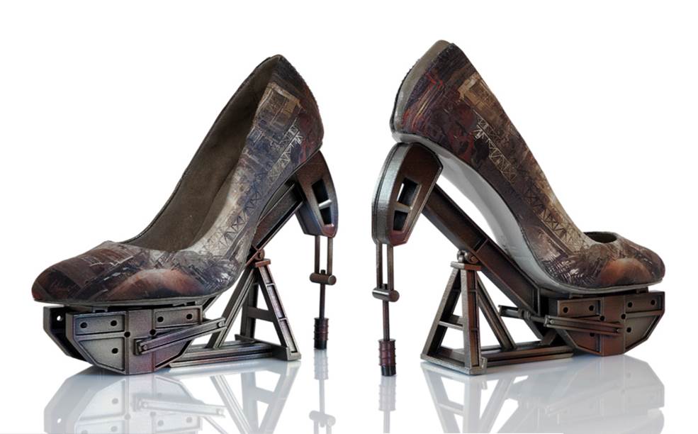
Do you hand-model/carve the impressive heels of your shoes and 3d print?

You are correct, I sculpt the components and my husband helps me with technical development

Which shoe is your favorite? Why?

I love the “Galvanica” pump from the “PAST” of Lost Civilizations as it gave me a wonderful experience of meeting with extraordinary people while developing it. Making it was a very beautiful journey that translated into the shoe

The platforms are solid in character and the upper shoe has more emotional qualities. How challenging is it to recreate an item that is conceived as heel and shoe?

To be honest, I don’t divide the shoe into upper and lower -it is one “organism”. It is all “cooked” intuitively.

I understand that the message of the collection is to analyze the current state of the earth. What overall impact do you dream your works of art will have in our society?

I don’t have high hopes of stopping some environmentally wrong projects to go through. But I am trying to influence on the subconscious of people, hoping this will echo somewhere, somehow…

Do you plan to further in the preservation subject, or do you have a new collection in the works?

There is something amazing boiling at the moment and I cannot say yet as it is rather fragile, but I cannot not hide a witty smile!

PALETTE TRENDS: Blue & Lemon Green

A soft, airy and placid combination is today’s fabric palette. It is hard not to like blue it is also hard to ignore as it surrounds us in our every day life. Blue is perceived as a color of stability, in light shades as having a calming effect. Using different textures in blue creates an interesting yet peaceful variation. Compensating the excitement that light-blue lacks, lemon green accents add rhythm to the palette. Although our example is a soft version of yellow-green it is a very vibrant color, literally! As experts say it reflects more light than other bright colors producing a stronger vibration. It is uplifting and promotes creativity but may border on being fatiguing or over stimulating. But no need to fret; simply use lighter shades on large areas reserving the stronger versions of it for accents. In a large room a sofa may be an accent piece much like a throw pillow in a smaller room. Knowing the implications of color helps us create rooms that are uncommon, pleasant and beautifully combined. In short this palette marries two opposite color personalities to create a complete environment. Below are designs that embrace using such stimulating color with confidence. Bravo!

  1. CLEMENCE, COBALT-LETTICE /HILL BROWN
  2. CARREG, LIME-CREAM / SANDERSON
  3. SOFA ANIS / PIERRE FREY
  4. PATOLA, CITRON / HILL BROWN
  5. MEPHISTO, BLANC /CREATIONS METAPHORES
  6. COMO, COMO /D.G. OSBORNE & LIITTLE
  7. CALLAS, 15 /CREATION BAUMANN

Fabrics by Daniel Fragata /design intern

Text by Andrea Chery /design associate

Alex Turco & Avanzato Design

Create an element of visual interest in your outdoor space by introducing a focal wall with a creative design and pop of color! We recently teamed up with Italian artist Alex Turco to develop a stunning decorative panel for an exterior backdrop in an outdoor garden. The large panels face the canal, positioned in a way that allows viewers to enjoy the artistic image from both the boat and garden. The rendering, a depiction of a sensual mermaid, was designed using a photographed image that was then skillfully layered using multi-media graphics. Once the illustration was completed, rock crystals were added to create visual depth and dimension. The end result is a beautiful one of a kind rendition of a free floating form surrounded by water and cascading crystals. When the sun hits the stones, the light is reflected onto the backdrop creating a dramatic eye-catching effect.

Designer's Pick - Orrefors Glass

Why not add a touch of elegance to your decor by incorporating a stunning glass design from the Orrefors collection? Showcasing the essence of classic Scandinavian beauty, these glassware assortments feature both utility glass and glass art, all made from polished crystal. The history behind the collection dates back to 1898 where, in Smaland, Sweden, expert Orrefors glassmakers worked alongside some of the top designers in the area to perfect their craft while developing new and innovative techniques and designs. Today the Orrefors team is made up of five designers, each of whom works to interject their own creative vision into the timeless and well refined collections that Orrefors is known for.

Look and be inspired by how the crystal glass adds a layer of sleek sophistication into each of these interior spaces.

Designer's Pick - Mark Voris

Mark Voris
Mark Voris
Mark Voris
Mark Voris

This beautifully painted landscape rendition showcasing the aura and richness of Tucson, Arizona is this week’s “Designer’s Pick.” I have not always been a fan of the western type of art, but the hand of Mark Voris captured my eye because of its unique “Van Goghesque” painting technique.

An international artist born in Franklin, Indiana, Voris later moved to Arizona in 1925 where he attended the University. Soon after graduating, he started to display an interest in various artistic outlets including printing, photo engraving and advertising. Through trial and error, Voris became a self taught well respected artist. The above painting is one from his collection that was designed using an impasto technique, a process in which paint is thickly laid on the surface of the canvas leaving the knife and brush strokes visible and layered with texture. We’ve also included a few more pieces from his extensive collection that display the same layered painting technique that the artist has become so famous for.

Mark Voris
Mark Voris
Mark Voris
Mark Voris

PALETTE TRENDS: Vibrant Colors

photo 1.2
photo 1.2

We have been gathering our fabrics and we are back with something great this month. We are featuring a mix of Manuel Canovas’ newest collection that lightens up our design world. Indeed, a strong statement is a palette of vibrant colors one next to another. This composition is made of equally saturated colors, any of which can dominate the palette. Its success is in the repeated use of all the colors in small amounts. For example by adding a large sofa in the fuchsia geometric fabric the palette becomes harmoniously fuchsia with a colorful framework. The options are endless!

In the printed designs of head designer Ariane Dalle the Uzbekistani women are working on their embroideries in the process of suzani making, everything from carrying seeds, hand weaving and nursing their children is depicted, as if paying homage to the labor of the women behind a craft which is basic yet becomes a sophisticated way to dress up our homes and ourselves. Dale’s designs celebrate the art of fabric making with a wide cultural perspective and a refined French spirit. This ensemble reminds me of certain indigenous cultures I have visited whose bold use of color in their elaborate prints and weaves embodies the artistic nature within humans that transcends culture, language, education or technology.

Color is dear to my heart because it can express a range of things from; geography, affluence, to personality and emotions. The indigenous people of San Cristobal, Mexico and Antigua, Guatemala (pictures below) engage colorful designs in their clothes and accessories in their everyday life, which are amazingly similar to those from Asia proof that we are undeniably connected thru color, art and nature.

photo 2
photo 2
  1. VOYAGE EN CHINE, TURQUOISE /MANUEL CANOVAS
  2. KERALA, ROSE INDIEN /MANUEL CANOVAS
  3. EBBTIDE /SHERWIN WILLIAMS PAINT
  4. MONCEAU, TURQUOISE /MANUEL CANOVAS
  5. NURA, CITRON /MANUEL CANOVAS
  6. FABULOUS GRAPE /SHERWIN WILLIAMS PAINT
  7. FOCH, CARDINAL /MANUEL CANOVAS
  8. BELLA, AQUA /MANUEL CANOVAS
  9. EXUBERANT PINK /SHERWIN WILLIAMS PAINT

RESORCES:

Michele Nessen Mikulskis

http://lifepart2.com/day-of-the-dead-in-chiapas-near-san-cristobal-de-las-casas/

http://www.panoramio.com/photo/14149516

http://www.tropicaldiscovery.com/regional_info/antigua_tours/vacations.php

http://www.traveljournals.net/pictures/7605.html

http://mexicotoday.org/culture/san-cristobal-de-las-casas

James Emil Bisttram

James Emil Bisttram, a native of Hungary, moved to New York City with his family at the age of eleven. Growing up as a commercial artist, Bisttram began to tailor his craft, creating a unique and identifiable style after years of studying successively at the National Academy of Design, Cooper Union, the Art Students League and the New York School of Fine and Applied Art. His works are a mix of dynamic symmetry and creative compositions reflective of the cosmic abstraction trends of the time heavily influenced by artist such as Picasso and Kandinksy. Each piece of art would make a beautiful addition in any home where classic art is treasured.