color

Palette Trends: Creamy Fresh

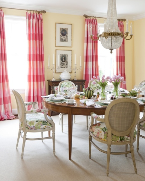
Today’s palette is a composition of comforting vanilla and refreshing soft mint, perfect for a "get away from the stress of daily life" room, to recoup, recharge and indulge in total peace. Also ideal for a guest bedroom, although guests may feel so comfortable they may not want to leave...

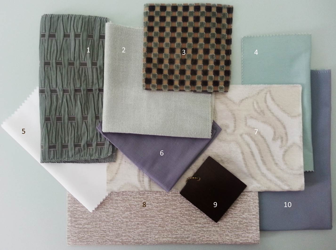
This color combination is very pleasant because subconsciously it reminds us of soft flavors and the subtleness of nature.  As part of the green family 'mint' is a restful hue promoting concentration. 'Vanilla' has the properties of both clean-white and happy-yellow, favorable when making a soft palette. Inspired by the velvet checkered pattern I like to keep it in the family and contrast with bronze, think of toasted almonds. Lastly add a soft touch of blue-violet, a stable and relaxing color like its blue parent.

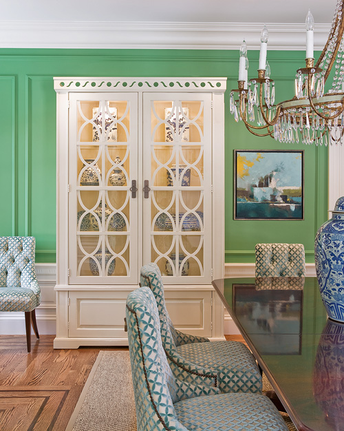
A great example of a calming mint palette is this bedroom by Tobi Fairley. It is both romantic and yummy at the same time, much like mint chocolate after dinner.

  1. LUX, SLATE / LARSEN
  2. BAMBOO FRIEZE, SKY / KRAVET
  3. VELVET / ZOFFANY
  4. YORK, 101 / CHRISTIAN FISCHBACHER
  5. MEPHISTO, SOLID TAFFETA / CREATIONS METAPHORES
  6. THAILANA, ALICE BLUE /LARSEN
  7. CAPULET, OPALESCENCE / GP HOLLY HUNT
  8. MEDIUM WALNUT WOOD FINISH
  9. STELLA, WHITE GOLD / GP HOLLY HUNT
  10. MERCURE, VERT MING / CREATIONS METAPHORES

Arcadian Home Guest Post - Dining Rooms

Hello, everyone! It’s Marie here with a guest post from Arcadian Home blog, a fabulous place to find interior design inspiration including great decorating ideas for everything from beautiful folding screens to glittering traditional chandeliers.

Those of you who are regular readers of Avanzato Design blog are already familiar with the always interesting and informative monthly palette trends series. Inspired by Vincenzo’s obvious love of color, we've pulled together eight of our favorite color-infused traditional dining rooms to share with you today. Please enjoy!

~ Marie

A traditional dining room with warm wood flooring is exquisitely dressed in soft yellows and accented with inviting lime-yellow end chairs.

Warm buttery yellow walls create an appealing background for this cheerful and slightly feminine traditional dining room. Drapery panels in pretty pink hues work beautifully with a large floral pattern on the chairs. Charming table decor gives this space a Sunday brunch feel.

Minty greens and blues bring a fresh modern take on traditional with a Chinoiserie twist. The vibrant wall color works beautifully with the pure white woodwork above and below.

Warm brown tones pair work well and tone down the bright orange fabrics in this updated traditional dining room. A beautiful mix of dining chairs includes two in chocolate brown velvet.

Brilliant turquoise brings this spacious dining room to life. Using so much color might seem like a bold design choice, but works here without overwhelming the room.

Wallpaper in white and pink on green brings a lively feel to this otherwise sedate dining room. The pretty traditional pattern creates a beautiful background for the wood furnishings in this space. Rather than the expected buffet lamps on the antique sideboard, silver vases of blooming branches mimic those in the wallpaper.

Vibrant pink is exquisite in this beautifully appointed traditional dining room. The deep pink hue is at once powerful and appealing. It must look even more stunning after dark in the glow from candles, wall sconces and chandelier.

This purple-infused dining room is beautiful on its own, but becomes an extraordinary space at the holidays with the addition of red decorative elements. If this room is any indication, purple and red seem to have a very companionable relationship. Images 1 | 2 | 3 | 4 | 5 | 6 | 7 | 8

What do you think of these traditional dining rooms? send us your comments and discover more home decor, accessories, and modern pendant lights at our blog!

PALETTE TRENDS: Blue & Lemon Green

A soft, airy and placid combination is today’s fabric palette. It is hard not to like blue it is also hard to ignore as it surrounds us in our every day life. Blue is perceived as a color of stability, in light shades as having a calming effect. Using different textures in blue creates an interesting yet peaceful variation. Compensating the excitement that light-blue lacks, lemon green accents add rhythm to the palette. Although our example is a soft version of yellow-green it is a very vibrant color, literally! As experts say it reflects more light than other bright colors producing a stronger vibration. It is uplifting and promotes creativity but may border on being fatiguing or over stimulating. But no need to fret; simply use lighter shades on large areas reserving the stronger versions of it for accents. In a large room a sofa may be an accent piece much like a throw pillow in a smaller room. Knowing the implications of color helps us create rooms that are uncommon, pleasant and beautifully combined. In short this palette marries two opposite color personalities to create a complete environment. Below are designs that embrace using such stimulating color with confidence. Bravo!

  1. CLEMENCE, COBALT-LETTICE /HILL BROWN
  2. CARREG, LIME-CREAM / SANDERSON
  3. SOFA ANIS / PIERRE FREY
  4. PATOLA, CITRON / HILL BROWN
  5. MEPHISTO, BLANC /CREATIONS METAPHORES
  6. COMO, COMO /D.G. OSBORNE & LIITTLE
  7. CALLAS, 15 /CREATION BAUMANN

Fabrics by Daniel Fragata /design intern

Text by Andrea Chery /design associate

PALETTE TRENDS: DEEP BLUE SEA

Deep blue sea …is a very dark color, but it has an exceptional richness that encompasses power, abundance, strength, and the imposing presence of royalty. Its deep character yields a fine contrast with any light crystal color such as sea foam, mint green, aquamarine. In this palette we have a deep blue velvet (#1) as the main fabric, its embossed floral pattern adds a subtle elegance to the already shimmery hand of velvet. Such enigmatic fabric is perfect for a focal point piece, a sofa for example. Add a pop of color with silk pillows and juxtapose it with additional pieces upholstered in the color family accents such as striped jade, light blue, aqua and sand. We added a large printed silk (#3) for curtains to continue the drama to the walls, it has a light background so it won’t be visually bulky, it brings rhythm by braking away the rigid stripes. It introduces a little vibrant rose to the composition for contrast. Compliment it further with a kidney pillow or an accessory in a rose tone. The contrasts and the rhythm between the patterns is gauged to deliver a brave yet welcoming space whether it’s a living room or a more intimate space.

Below you will find some examples of courageous design using dark blue as the center of their color scheme. The first image is the Blue Room in the White House as it was around 1903 during President Teddy Roosevelt’s administration. The second image is a daring kitchen showcasing a contemporary dark blue with deep earth tones and contrasting white solids.

  1. PEONIS, 50 /JAB
  2. BACKSTAGE, MINERAL / KRAVET
  3. LE CABINET CURIOSITES, ROSE /MANUEL CANOVAS
  4. JULES, PIVOINE /MANUEL CANOVAS
  5. ENGLISH BURI WOOD FINISH /NANCY CORZINE
  6. QUEENS, SPRINGFIELD /SHYAM AHUJA
  7. ILLUSION, PARIS BLUE /GREAT PLAINS HH
  8. SOIREE, MIDORI /GREA PLAINS HH
  9. MARIN, NATTIER /MANUEL CANOVAS
  10. NATURAL OAK WOOD
  11. ROYAL FLUSH, BLUE CHIP /GREAT PLAINS HH

Reference;

http://www.whitehousemuseum.org/floor1/blue-room-history.htm

http://www.cococozy.com/2010/12/color-watch-dark-rooms-pitch-black-and.html

Alex Turco & Avanzato Design

Create an element of visual interest in your outdoor space by introducing a focal wall with a creative design and pop of color! We recently teamed up with Italian artist Alex Turco to develop a stunning decorative panel for an exterior backdrop in an outdoor garden. The large panels face the canal, positioned in a way that allows viewers to enjoy the artistic image from both the boat and garden. The rendering, a depiction of a sensual mermaid, was designed using a photographed image that was then skillfully layered using multi-media graphics. Once the illustration was completed, rock crystals were added to create visual depth and dimension. The end result is a beautiful one of a kind rendition of a free floating form surrounded by water and cascading crystals. When the sun hits the stones, the light is reflected onto the backdrop creating a dramatic eye-catching effect.

Designer's Pick - Mark Voris

Mark Voris
Mark Voris
Mark Voris
Mark Voris

This beautifully painted landscape rendition showcasing the aura and richness of Tucson, Arizona is this week’s “Designer’s Pick.” I have not always been a fan of the western type of art, but the hand of Mark Voris captured my eye because of its unique “Van Goghesque” painting technique.

An international artist born in Franklin, Indiana, Voris later moved to Arizona in 1925 where he attended the University. Soon after graduating, he started to display an interest in various artistic outlets including printing, photo engraving and advertising. Through trial and error, Voris became a self taught well respected artist. The above painting is one from his collection that was designed using an impasto technique, a process in which paint is thickly laid on the surface of the canvas leaving the knife and brush strokes visible and layered with texture. We’ve also included a few more pieces from his extensive collection that display the same layered painting technique that the artist has become so famous for.

Mark Voris
Mark Voris
Mark Voris
Mark Voris

PALETTE TRENDS: Vibrant Colors

photo 1.2
photo 1.2

We have been gathering our fabrics and we are back with something great this month. We are featuring a mix of Manuel Canovas’ newest collection that lightens up our design world. Indeed, a strong statement is a palette of vibrant colors one next to another. This composition is made of equally saturated colors, any of which can dominate the palette. Its success is in the repeated use of all the colors in small amounts. For example by adding a large sofa in the fuchsia geometric fabric the palette becomes harmoniously fuchsia with a colorful framework. The options are endless!

In the printed designs of head designer Ariane Dalle the Uzbekistani women are working on their embroideries in the process of suzani making, everything from carrying seeds, hand weaving and nursing their children is depicted, as if paying homage to the labor of the women behind a craft which is basic yet becomes a sophisticated way to dress up our homes and ourselves. Dale’s designs celebrate the art of fabric making with a wide cultural perspective and a refined French spirit. This ensemble reminds me of certain indigenous cultures I have visited whose bold use of color in their elaborate prints and weaves embodies the artistic nature within humans that transcends culture, language, education or technology.

Color is dear to my heart because it can express a range of things from; geography, affluence, to personality and emotions. The indigenous people of San Cristobal, Mexico and Antigua, Guatemala (pictures below) engage colorful designs in their clothes and accessories in their everyday life, which are amazingly similar to those from Asia proof that we are undeniably connected thru color, art and nature.

photo 2
photo 2
  1. VOYAGE EN CHINE, TURQUOISE /MANUEL CANOVAS
  2. KERALA, ROSE INDIEN /MANUEL CANOVAS
  3. EBBTIDE /SHERWIN WILLIAMS PAINT
  4. MONCEAU, TURQUOISE /MANUEL CANOVAS
  5. NURA, CITRON /MANUEL CANOVAS
  6. FABULOUS GRAPE /SHERWIN WILLIAMS PAINT
  7. FOCH, CARDINAL /MANUEL CANOVAS
  8. BELLA, AQUA /MANUEL CANOVAS
  9. EXUBERANT PINK /SHERWIN WILLIAMS PAINT

RESORCES:

Michele Nessen Mikulskis

http://lifepart2.com/day-of-the-dead-in-chiapas-near-san-cristobal-de-las-casas/

http://www.panoramio.com/photo/14149516

http://www.tropicaldiscovery.com/regional_info/antigua_tours/vacations.php

http://www.traveljournals.net/pictures/7605.html

http://mexicotoday.org/culture/san-cristobal-de-las-casas

James Emil Bisttram

James Emil Bisttram, a native of Hungary, moved to New York City with his family at the age of eleven. Growing up as a commercial artist, Bisttram began to tailor his craft, creating a unique and identifiable style after years of studying successively at the National Academy of Design, Cooper Union, the Art Students League and the New York School of Fine and Applied Art. His works are a mix of dynamic symmetry and creative compositions reflective of the cosmic abstraction trends of the time heavily influenced by artist such as Picasso and Kandinksy. Each piece of art would make a beautiful addition in any home where classic art is treasured.