Design Ideas

It's A Boy!

An atypical splash of color for a growing boy’s room. Statistically, boys prefer an interior with blue and green colors—but who is to say boys are not partial to the other colors on the spectrum?

This combination of fabrics is impartial towards color, sex, or time. It is designed to depict the joy of life in a setting that adapts to a baby boy’s changing moods and humors.

This fabric combination has a story behind it: when we started an interior design project in Miami, Florida for a young couple with a three-year-old daughter and a boy “on the way.” Plans were made for a total renovation of their house on the Miami waterfront with one room assigned for their daughter and another one for the baby boy.

Keeping in mind kids grow so fast, the nursery was designed for the transition from baby to toddler and from toddler to child, so we used a palette of soft muted yellows. The interior design concept we applied was subtle with touches of whimsy. We added hand-painted texture to the walls, and the ceiling is an interior design master piece depicting little stick-figure boys doing different activities like riding a bike and sailing, etc. Young and old alike enjoy finding the stick figures throughout the painting.

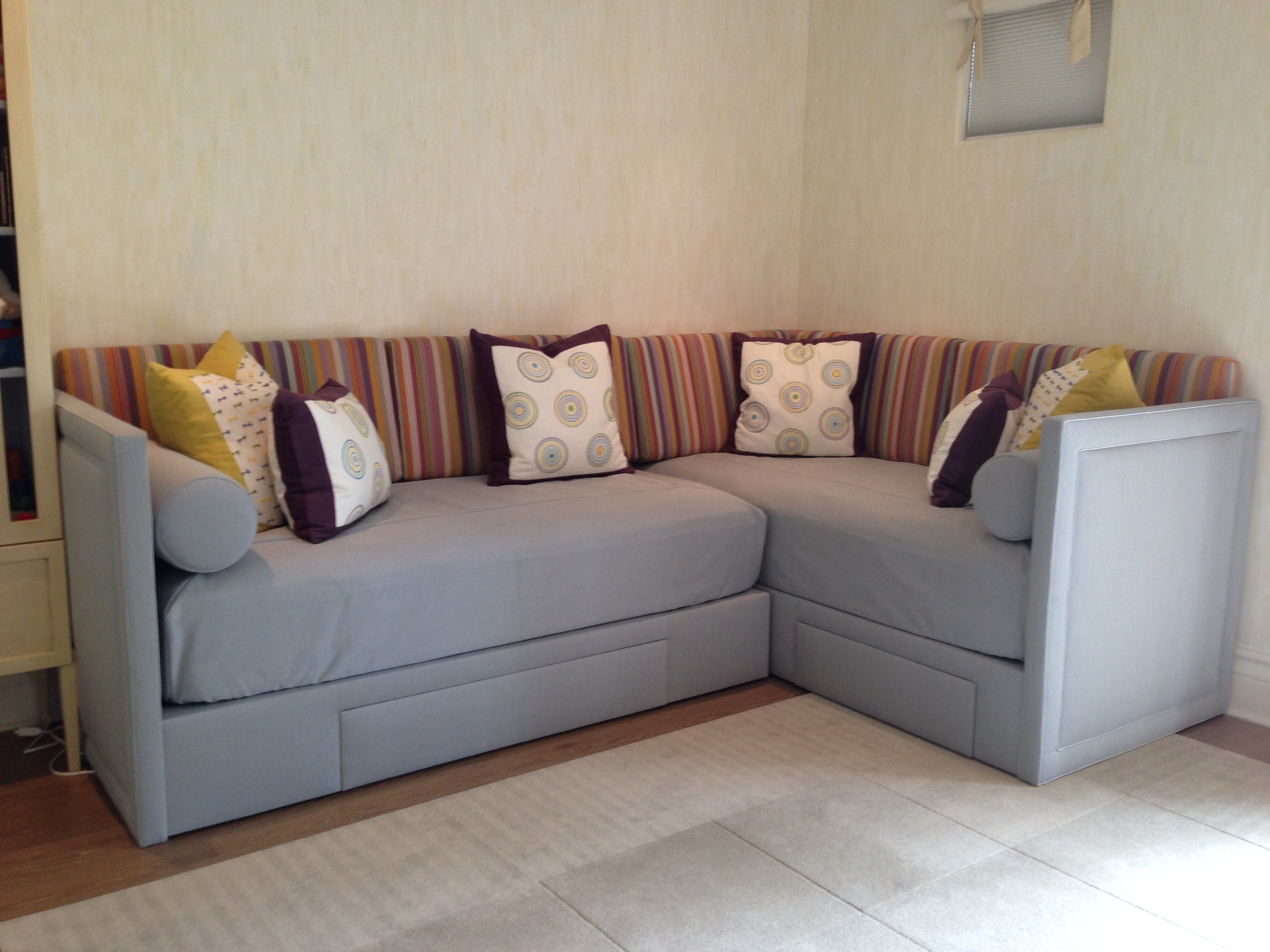
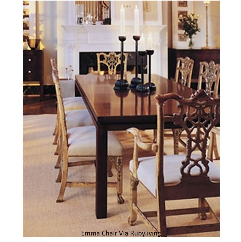
As the little boy outgrew his crib, a pair of custom beds was made in an L-shape keeping the room open allowing for ample play space and for little guests to spend the night in the second bed. The frames were upholstered in a heavy silvery-blue woven fabric which will last for years of boyish use and will appeal to boys no matter the age. For the cushions and the pillows we used the fun patterns as they add a splash of color without taking away from the rest of the décor and the painted ceiling. Conveniently the beds can be updated effortlessly simply by chainging the cushions with a color and pattern appropriate for the age while the understated background colors will transcend the trends.
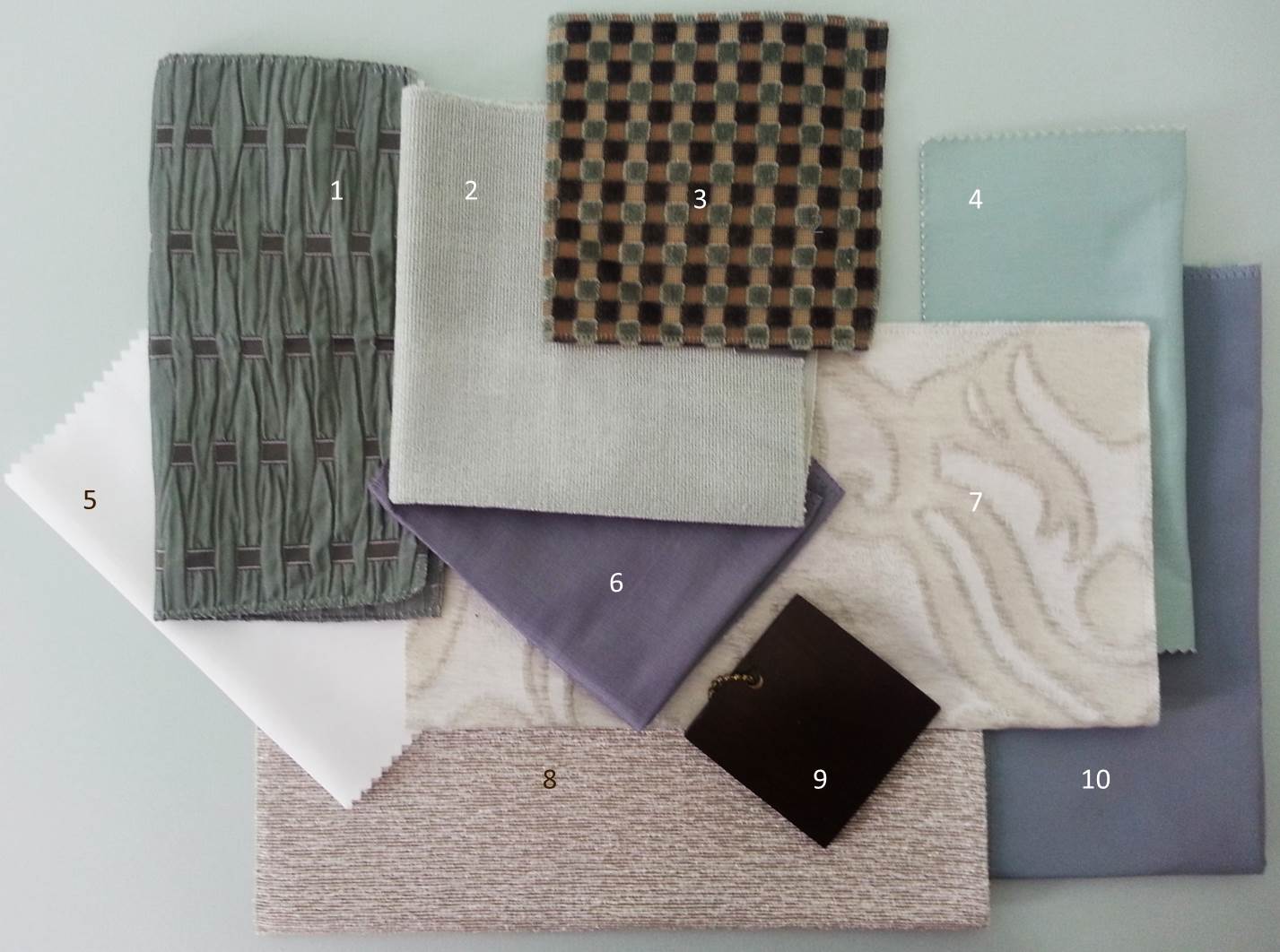
  1. COLLIN, 10 / SACHO
  2. 30691-410 / KRAVET
  3. MILLSTONES, LEAF-BLUE-MAUVE / LEE JOFA
  4. PRIMA ALPACA, MULBERRY / SANDRA JORDAN
  5. PRIMA ALPACA, DAFFODIL / SANDRA JORDAN
  6. BOW TIE, GREEN-YELLOW-INDIGO / LEE JOFA

Edwardian Edge

Adding An Edwardian Edge To Your Dining Room

A time of grandiose and splendour, the "Belle Epoque" as it was also known may have been short-lived but it brought with it a breath of fresh air. Fresh air that can be easily applied to your home with just a few key changes.

Period interior design is very on-trend at the moment and Edwardian style provides you with the opportunity to achieve an alternative look in your home's interior. Should you be choosing to transform your home, we believe the dining room is an excellent place to start. In the past there was a significant focus on mealtimes, so the dining room was a focal point of the home, follow our tips below and add the Edwardian experience to your own dining room.

Furniture

Usually reproduction pieces, Edwardian furniture was known for reviving styles from previous eras and was largely an eclectic marriage of styles and influences. Whether you choose baroque, Art Nouveau or Tudor pieces, the key thing to look out for is furniture that is smaller and less bulky. Edwardian furniture was known for being a departure from the large, heavy and formal Victorian furniture that preceded it.

For a truly Edwardian look, consider furniture made from mahogany or lighter materials such as wicker or bamboo.

Flooring

For an authentic look in any interior, choose highly polished wooden floors that are stained with an oak coloured varnish.

Wallpaper

When it comes to wallpaper, choose a design that adds a breath of fresh air to your interior. Perhaps consider paper that features floral interior designs such as roses, wisterias or sweet peas, or perhaps a striped design. When it comes to wall interior design, a key Edwardian look was to break up the wall with a dado rail. Perhaps choose to emulate this and paper half the wall with a patterned design and paint the rest of the wall.

Colour schemes

Continuing the floral theme, choose pastel colour schemes and floral colours. Think lilacs, leaf greens and primrose yellows.

Lighting

Electrical lighting was relatively new in the Edwardian period and therefore was designed to be grand. Fabric lampshades with frills and tassels, smoked glass and ceiling roses are all very true of the period.

Heating

Again still a relatively new innovation, radiators were a big deal during the Edwardian period and were designed to be a talking point of the home. Take inspiration from these reproduction cast iron radiators and choose updated colours to contrast your space. These reproduction radiators stay true to Edwardian designs but are equipped to modern plumbing and interior design standards.

Palette Trends: Creamy Fresh

Today’s palette is a composition of comforting vanilla and refreshing soft mint, perfect for a "get away from the stress of daily life" room, to recoup, recharge and indulge in total peace. Also ideal for a guest bedroom, although guests may feel so comfortable they may not want to leave...

This color combination is very pleasant because subconsciously it reminds us of soft flavors and the subtleness of nature.  As part of the green family 'mint' is a restful hue promoting concentration. 'Vanilla' has the properties of both clean-white and happy-yellow, favorable when making a soft palette. Inspired by the velvet checkered pattern I like to keep it in the family and contrast with bronze, think of toasted almonds. Lastly add a soft touch of blue-violet, a stable and relaxing color like its blue parent.

A great example of a calming mint palette is this bedroom by Tobi Fairley. It is both romantic and yummy at the same time, much like mint chocolate after dinner.

  1. LUX, SLATE / LARSEN
  2. BAMBOO FRIEZE, SKY / KRAVET
  3. VELVET / ZOFFANY
  4. YORK, 101 / CHRISTIAN FISCHBACHER
  5. MEPHISTO, SOLID TAFFETA / CREATIONS METAPHORES
  6. THAILANA, ALICE BLUE /LARSEN
  7. CAPULET, OPALESCENCE / GP HOLLY HUNT
  8. MEDIUM WALNUT WOOD FINISH
  9. STELLA, WHITE GOLD / GP HOLLY HUNT
  10. MERCURE, VERT MING / CREATIONS METAPHORES

Arcadian Home Guest Post - Dining Rooms

Hello, everyone! It’s Marie here with a guest post from Arcadian Home blog, a fabulous place to find interior design inspiration including great decorating ideas for everything from beautiful folding screens to glittering traditional chandeliers.

Those of you who are regular readers of Avanzato Design blog are already familiar with the always interesting and informative monthly palette trends series. Inspired by Vincenzo’s obvious love of color, we've pulled together eight of our favorite color-infused traditional dining rooms to share with you today. Please enjoy!

~ Marie

A traditional dining room with warm wood flooring is exquisitely dressed in soft yellows and accented with inviting lime-yellow end chairs.

Warm buttery yellow walls create an appealing background for this cheerful and slightly feminine traditional dining room. Drapery panels in pretty pink hues work beautifully with a large floral pattern on the chairs. Charming table decor gives this space a Sunday brunch feel.

Minty greens and blues bring a fresh modern take on traditional with a Chinoiserie twist. The vibrant wall color works beautifully with the pure white woodwork above and below.

Warm brown tones pair work well and tone down the bright orange fabrics in this updated traditional dining room. A beautiful mix of dining chairs includes two in chocolate brown velvet.

Brilliant turquoise brings this spacious dining room to life. Using so much color might seem like a bold design choice, but works here without overwhelming the room.

Wallpaper in white and pink on green brings a lively feel to this otherwise sedate dining room. The pretty traditional pattern creates a beautiful background for the wood furnishings in this space. Rather than the expected buffet lamps on the antique sideboard, silver vases of blooming branches mimic those in the wallpaper.

Vibrant pink is exquisite in this beautifully appointed traditional dining room. The deep pink hue is at once powerful and appealing. It must look even more stunning after dark in the glow from candles, wall sconces and chandelier.

This purple-infused dining room is beautiful on its own, but becomes an extraordinary space at the holidays with the addition of red decorative elements. If this room is any indication, purple and red seem to have a very companionable relationship. Images 1 | 2 | 3 | 4 | 5 | 6 | 7 | 8

What do you think of these traditional dining rooms? send us your comments and discover more home decor, accessories, and modern pendant lights at our blog!

DESIGNER'S PICK: Wood Turning

1
1

Today we’re celebrating the refined beauty and craftsmanship found in the art of wood turning. By using non-traditional techniques to reinvent traditionally styled designs, modern day artists gain the freedom and ability to express themselves creatively with wood, reinventing the material and creating an entirely new aesthetic. Featured below are innovative examples, all taken from Michigan collector Robert Bohlen’s personal selections, which were acquired during world travels. Each piece, skillfully made, was created not merely for function, but to stand-alone as a captivating piece of art.

Wood turning Dirk Bakker