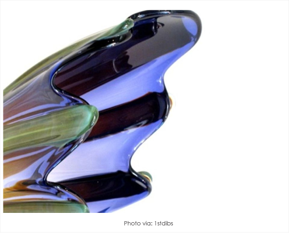
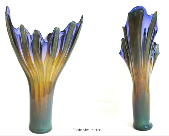
While looking to find the perfect centerpiece for our new client, we found ourselves drawn to this delicate display radiating with intense color and an exquisite frame. Masterfully constructed to work as both a functional form and a decorative display, this week’s, “Designer’s Pick of the Month” is a beautiful Monumental glass vase created by American artist Richard Royal. With the design having an asymmetrical composition, the viewer is able to rediscover the piece at every new angle. Boasting a stunning array of colors, unified with hints of gold, this impressive piece is sure to captivate guests and would make a grand statement in any home. Overall Dimensions33” H X 21” W X 8.5” D X 6” Dia

A JEWELED PALETTE

I was recently hired, by one of my clients, to create a stylish relaxing retreat for his wife that would serve as her own little calming oasis. The color palette, which showcases a collection of yellow-based beiges paired beautifully with saturated jewel tone accents, appeals to both feminine and masculine sensibilities. The scheme works together perfectly to create this fabulous bright and airy getaway. Located in Caracas, Venezuela this contemporary styled apartment showcases the perfect blend of open spaces and cozy corners. The end result is stunningly chic and luxurious living space ideal for stylish relaxation.

In the salon, filled with rich lavenders, sky blues and hint of pink rose, a graphically bold painting, created by artist Markus Oehlen, was placed alongside the focal wall. The painting, which immediately catches your eye upon entry, was actually not a feature in the initial design process. Unaware of the painting prior to picking this scheme, it was only during the installation of the furnishings that I learned that the client owned such a beautiful piece. Hung horizontally, (to allow the composition to flow with the scheme) the intriguing painting featuring an un-canny palette that worked fabulous with the décor.

With a decorative scheme that’s kept simple and chic, a chandelier made from hand blown tubular Murano glass is showcased over the dining room table. A symmetrical floor plan gives the space a sense of balance, while the repeated use of similar colors creates a cohesive look in the living space as well as the attached sitting and dining area. Looking for ways to add visual interest in a dining room? Try switching out the end chairs with a bolder contrasting variation. The adjustment is sure to give the space a splash of pazzazz.
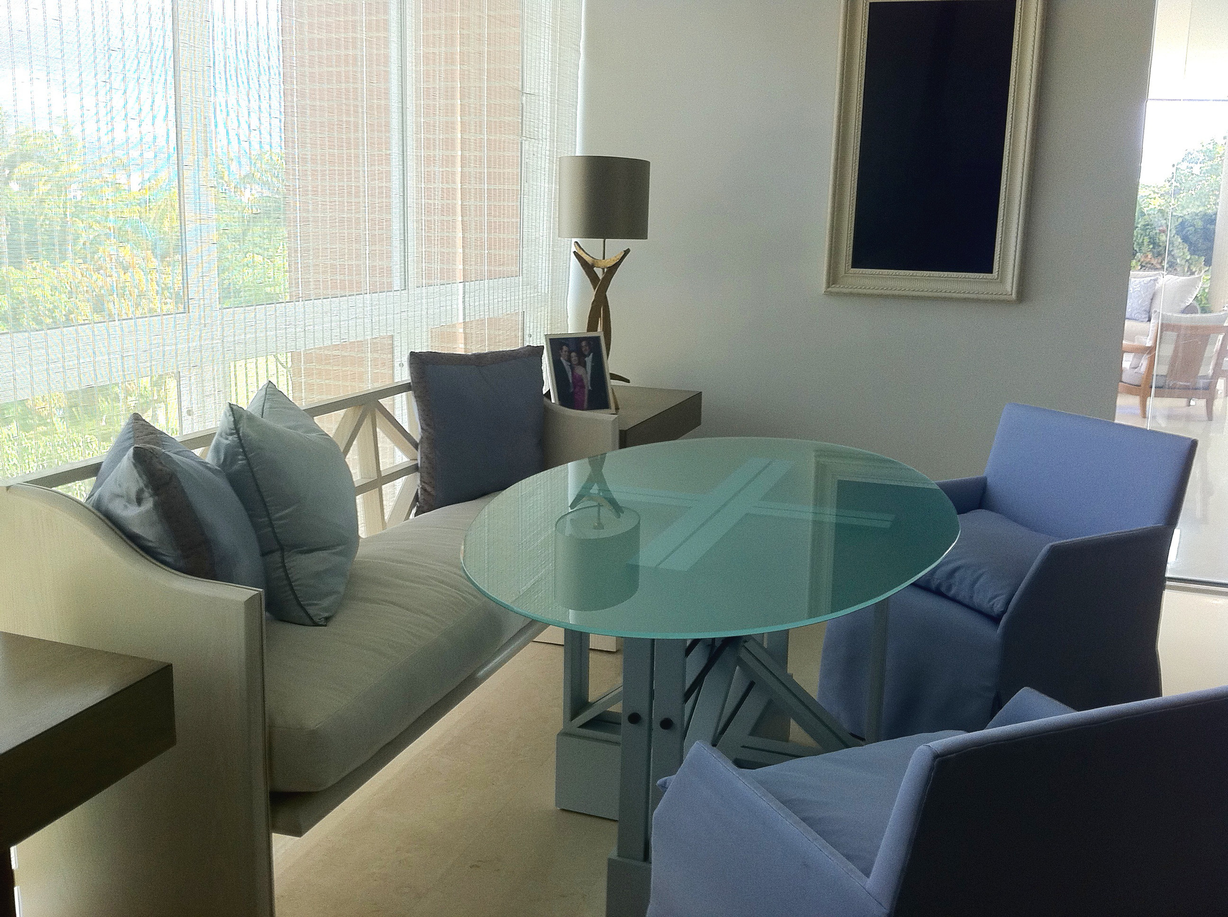
This part of the dining area, decorated with sheer breezy match stick blinds, was added so that the clients could to take full advantage of the views while dining in an intimate setting.
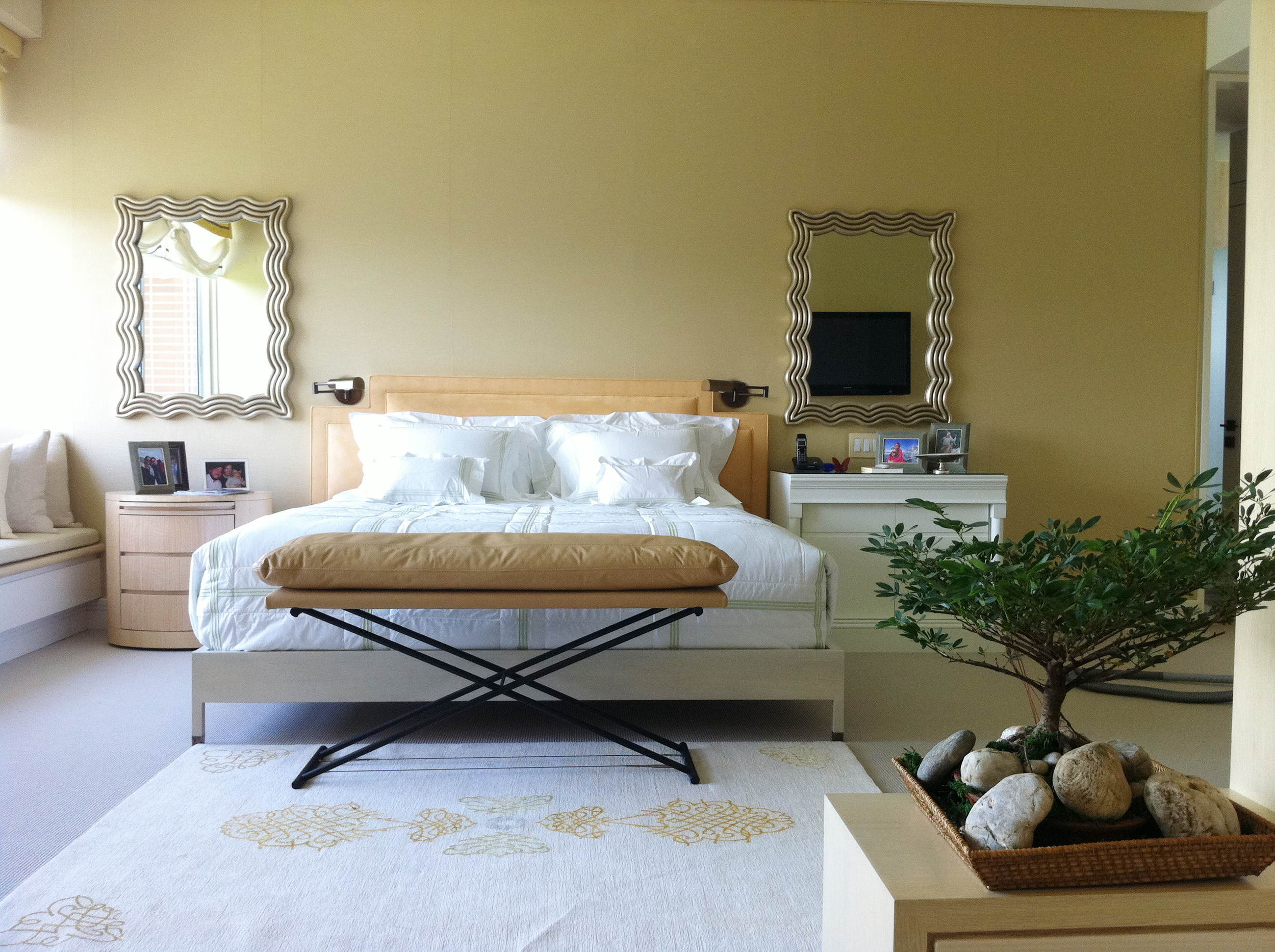
This beautiful master suite, which also includes a sitting area, shares a feeling of comfort and relaxation. It has been decoratively styled with two dissimilar nightstands, curved mirrors, and a cantaloupe palette to create a classically stylish scheme.


Displayed in this sitting area is a mixture of hard lines and soft edges layered with textures and a hint of color. A pair of framed mirrors, working almost like pieces of art, give this transitional space a modern edge. In smaller spaces, where heavy art may be overbearing and distracting, mirrors can work effectively to add visually interest while giving the illusion of an expanded floor space.
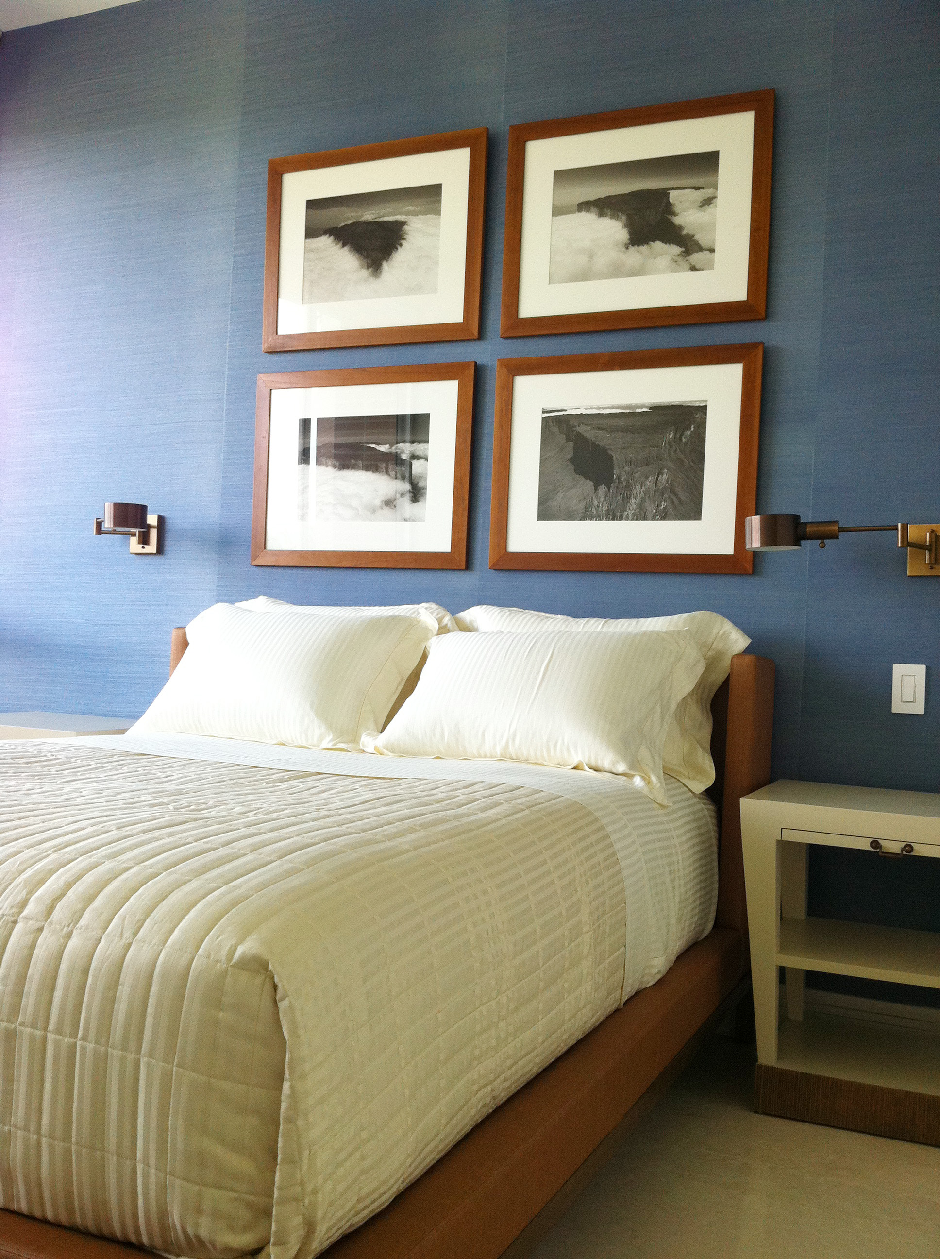
In the guest bedroom a blue raffia wall paper was used on the focal wall, layered with black and white landscape portraits framed in the same wood tone as that seen on the bed fabric. Incorporating photos and art into your décor is a simple and easy way to give your space personality. Custom designed nightstands, simplistic in form and functionally.
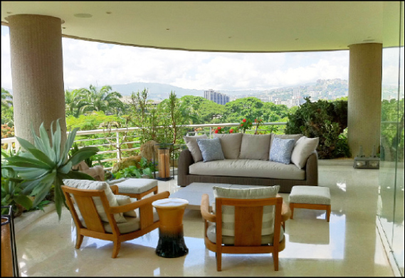
To wrap up this high style renovation, folding glass panels were installed in the living room, opening up to a terrace that features breathtaking surrounding views. Using colors similar to those in nature in the décor allowed an easy transition from interior to exterior without visually detracting from the landscape.
PALETTE TRENDS: Masculine Blues-Greys
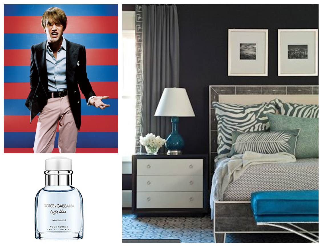
Today we will show you how to use light blue and blue-greys in a grown up way. Blue is definitely a colour preferred by boys, and as we can see here it is used for cologne by Dolce & Gabbana among others and for man’s clothes as featured in this image from esquire.com/style/preppies-attack. The style designer uses light blue with dark accents on a red background to reinforce the masculine expression of the outfit. A great example of a masculine yet attractive to both sexes is this master bedroom found at Houzz.com, it uses grays, neutrals, blues and lagoon greens all popped with a bright aqua bench.

In our palette trend of June we are creating a soft room without giving up man’s favorite colours. The odd colour Ruby-Red, adds a little sharpness to the composition because it is strong and feminine at the same time. This is what artists would call an anomaly; a colour that stands alone in a very different (or far apart) colour scheme. It would be great as an accent back pillow on a side chair with this fabulous Paisley Park pattern. Light blue and greys are the central colours of this palette, the charcoal grey and slate greys help create contrast with the soft character of the cream and the blue (otherwise it would read more like a baby boy’s room). In essence the soft colours and the blue-greys are repeated in small pops of darker variations throughout with a red contrast which completes a tailored room sophisticated enough for a master suite, guestroom or family room since its design is defined by a balance of masculine and feminine elements.
- VIBE BLUE SHADOW OVAL/ WALKER ZANGER
- LIMESTONE/ COVERING ETC.
- NARCISSUS, GREYSTONE/ HOLLY HUNT LEATHER
- CABANA RING BORDER, SYCAMORE/ SAMUEL & SONS
- SPARE RIB, BUTTERMILK/ GP/ HOLLY HUNT
- TIVOLI, 5 BLUE/ HOLLAND & SHERRY
- TATAMI, UMI/ Q COLLECTION
- SOMERSET, RUBY/ ROGERS & GOFFIGON
- LIDO, AZURE/ Q COLLECTION
- PAISLEY PARK, STEEL BLUE / GP/ HOLLY HUNT
- VALENTINO, GUNMETAL/ GP/ HOLLY HUNT
Image resource:
www.esquire.com/style/preppies-attack-0308-2
www.houzz.com/photos/97856/Master-Bedroom-contemporary-bedroom-atlanta
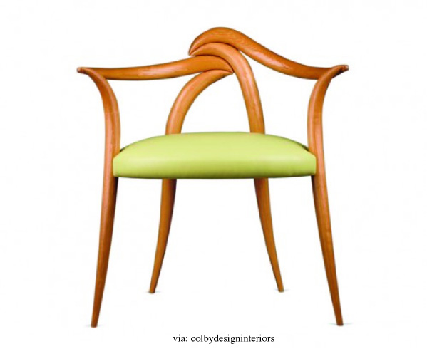
DESIGNER'S PICK: Laminated Cherry Chair

Today’s “Designer Pick” showcases an exquisite piece created by renowned craftsmen and sculptor David Upfill-Brown. The laminated cherry chair, minimal in construction and simplistic in form, boasts an asymmetrical frame that exudes an underlying hint of drama as it’s configured to create an overall delicate and artistic display. Soft wooden curves gently bend to create a fluid frame that marries together gracefully to make the chair an instant classic. Bold yet refined, the piece would make a great addition in any home where craftsmanship is prized and stunning designs are cherished.
Take a look at a few of these other stunning creations also crafted by the artist himself. Conveying the same overall delicate nature and fluid design as their predecessor the Cherry Chair, they too display as beautiful, functional works of art.

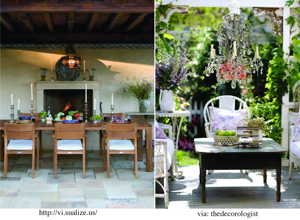
Exterior Accessories

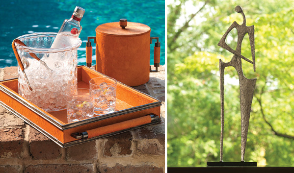
Create a stunning outdoor space fit for stylish entertaining with accent pieces that will turn your outdoor scheme into a sweet escape. Last month we talked to you about outdoor living design ideas and outdoor fabrics. Today we’re featuring a vast array of outdoor accessories that were designed to expand your outdoor experience while creating a striking visual. As we all know, furniture is indeed vital in creating a functional outdoor living area, though without the accessories, it’s like dressing up without the jewelry.
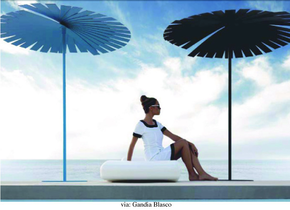


Cozy up under an outdoor umbrella or a covered canopy and truly take advantage of your exterior space by creating an area that reads like an extension of your home. Great for lounging and entertaining, these stylish accessories are both bold and beautiful, working to develop cozy outdoor environments that could entice anyone to spend more of their beautiful summer afternoons outdoors. Outdoor furnishings have evolved exponentially over the years and the vast array of options can be incorporated to create visually captivating outdoor environments allowing one to be consistent in décor from the inside to the outside whether you are a minimalist, a classicist or an urban contemporary. There are countless weather-resistant materials and colors. Ornament your garden with decorative accessories while adding an intriguing layer of texture for drama. Express yourself and create an environment that speaks to your design style through the use of accents and accessories. Toss in a few bold colored furnishings and watch your outdoor haven come to life. Sculptures, fixtures and Lighting, like this gorgeous cordless lamps from Live Anywhere collection are just a few of the many items that can be used as features to expand your outdoor experience both visually and functionally.


PALETTE TRENDS: Outdoor Fabrics
For our trend this month we’d like to explore exterior fabrics as the trends for outdoors have changed significantly in the past 20 years. Not so long ago, like some of us can still remember, there were no exterior fabrics or exterior cushions for that matter. In the early 1900s people went from logs and carved stone to elaborate exterior metal chairs as furniture to “enjoy” their porches, although it was a great development in durability the lounging part was dubious.
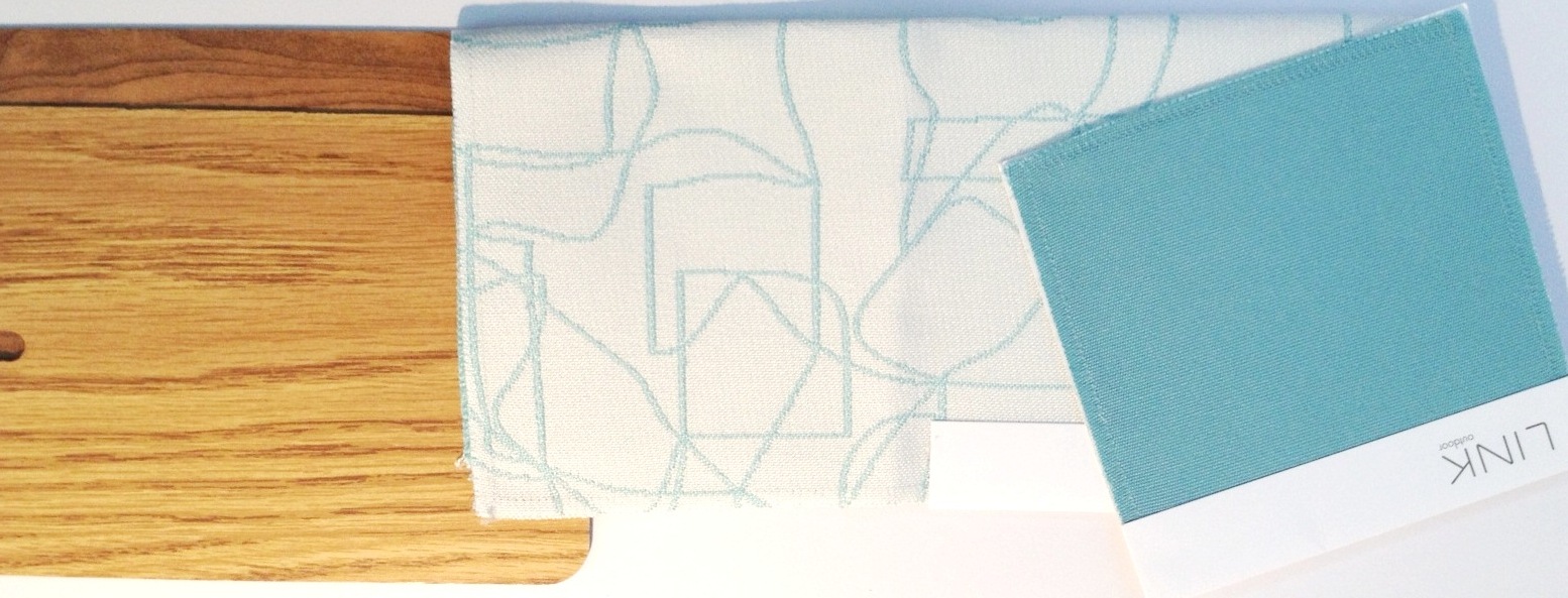
Slowly but surely the problem of outdoor lounging has been solved and thanks to manufacturers like Sunbrella, a maker of awning fabrics who developed a better exterior fabric than the vinyl we all remember with a sticky and squeaky sound, today we can indulge in the comfort and detailed décor of our yards as much as that expected of the interior of our homes. Their great success is based on the process of dying the fabric and replacing cotton with acrylic fiber; this process is identified as “solution dyed acrylic”. When selecting exterior fabrics we look for 100% dyed acrylic meaning the fibers are color dyed before weaving them making the fabrics highly fade resistant, washable, kid friendly and pet friendly. Additionally these fabrics are inherently mold resistant and water repellant and what is best is that the softness has improved tremendously in the last decade, so much so that designers are using it around the house for its resistance to the abuse in kids’ rooms, dining rooms, etc. When it comes to color the company Link stands out with outstanding bright colors and retro pattern designs, we have used them both for exterior and interior upholstery. The image below shows a breakfast room that endures a lot of traffic, we selected these Link fabrics for their color and stain resistance.

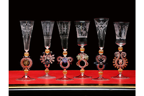
DESIGNER'S PICK : Murano Goblets

Today’s “Designer Pick” showcases a beautiful vintage rendition of the traditional Murano goblets and champagne flutes handmade from blown glass. Having recently purchased the assortment for a new client, we were drawn to the collection's elaborate use of detailing and stunningly intricate designs. The craft of Murano glass-making is heavily influenced in form by Asian and Muslim art and is believed to date as far back as the 9th century. Featuring an ornate base with hints of color and subtle graphics alongside the glass, the delicate setting immediately sets the stage for a high-end dining and entertaining experience. Not only are each of the unique pieces visually engaging, but you will find that the goblets, so full of history, are so much more than simply a house for your drinks, but rather a topic of conversation.

Outdoor Living

SUMMER: as it approaches, our attention is turned to designing our gardens, yards and outdoor spaces. Create a calming outdoor haven for stylish relaxation and comfort with a mixture of fixtures, furnishings and accessories. When designing an outdoor space, ideally the focus should be on functionality. Find your style, whether modern or classical, or form your own eclectic look by incorporating symmetry between the two. A harmonious design will project the perfect balance of comfort, functionality, and style.


LIGHTING: set the mood and create an ambiance with the insertion of candles, lanterns, and outdoor chandeliers. Large-scale lanterns and candles, sought out for their versatility as they fit seemingly well with any décor, tend to give off a soft glow that is perfect for outdoor spaces. They can be stylishly arranged and displayed wherever a touch of light is needed. Inserted over your seating, lounging or gathering area, the incorporation of a chandelier will add a component of elegance, grandeur and formality to any outdoor décor. The dramatic lighting display will create an air of sophistication at any garden party and a sense of romance at a softly lit outdoor dinner.
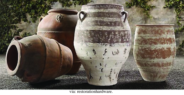

ACCESSORIES: Give your outdoor space character and enrich it with a stylish array of planters and outdoor decorative pieces. Made from zinc and reclaimed wood, the beauty found in these planters, inspired by those seen throughout many 19th century European estate gardens is brought out by their antiqued look and vintage charm.

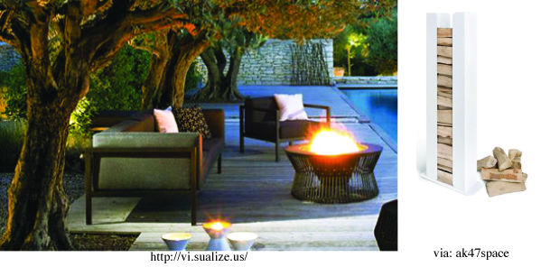
FIRE ELEMENT: Make your outdoor garden one that can be enjoyed throughout the seasons. Fireplaces can help create a seamless leisure corner, as they are ideal for lounging-next-to on long summer nights and continuously through the fall and winter months, Placed as a group, as a focal point or a couple small touches of warmth spread out, this element can transform your yard into the perfect outdoor entertaining area.

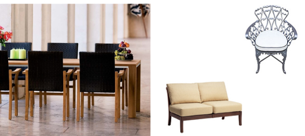

FURNITURE: The options when choosing outdoor furnishings are vast, and picking the right pieces are fundamental in creating a functional and sophisticated space. To avoid major deterioration and discoloration, your pieces should be able to withstand the element of heavy rain and harsh sun. Above are few examples of simplistic and modern furnishings that would work well in complimenting the outdoor elements, while providing a comfortable space for lounging and relaxation.
PALETTE TRENDS: Pale Red-Violet
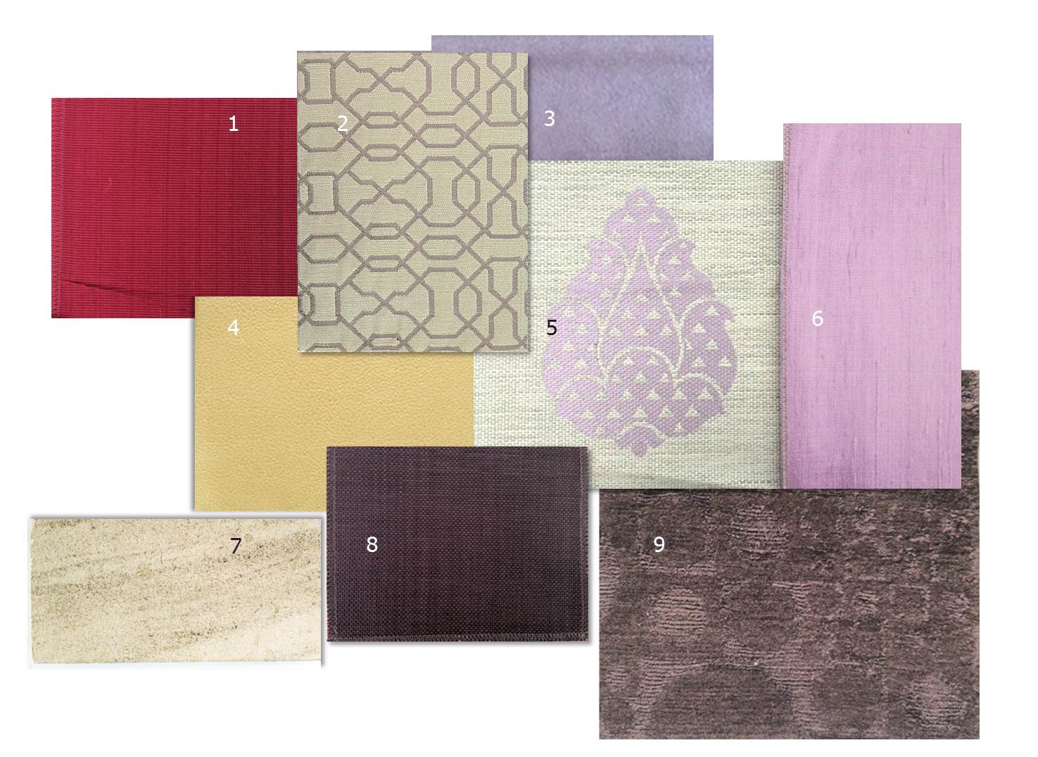
Lavender-Yellow was the palette trend we discussed last month. Today we would like to talk about Red-Violet. We actually used the red-violet fabrics (from Castel 5 and Dedar 6) as a pillow combination and it was very exquisite, we have received many compliments on the charm of the rose-violet and tan combo. Here we show how red-violet doesn’t only work in girls’ rooms or Victoria Secret’s bags. This color scheme is an “accented analogic” meaning three colors near each other on the color wheel –violet, red-violet, and red– are accented by the complementary hue (opposite on the color wheel), in this case yellow-green is the opposite colour to red-violet and is key in giving a pop to the pale red-violet composition. Instead of creating a delicate feminine setting with red-violet we suggest using colors near red-violet to add different qualities to the character of the scheme; aubergine, grape, fuchsia-red and lilac. Notice they are not toned down colours but they are vibrant accents that can be placed in any neutral backdrop be it, earth tones, whites, or grays. This color scheme is definitely meant to add sharpness to a room avoiding feminine or masculine appeals.
- V.I.P. – COSMOPOLITAN /GP /HOLLY HUNT
- RAFAEL UPTOWN – WISTERIA /ROBERT ALLEN
- ASPEN – LILAC /ARABEL FABRICS
- SEVILLA – TOMATILLO /HUNT LEATHER
- SHALIMAR – ROSE /CASTEL
- FANFARA – 23 /DEDAR
- LIMESTONE – WHITE DUNE /COVERINGS ETC
- MARRAKESH – GRAPE /GP /HOLLY HUNT
- NEIGE RUG – KJCO /MANSOUR MODERN
SPECIAL FEATURE: Floral Arrangements

What a great picture of a flower garden. The reason we love this picture is because nature is a part of us, observing its beauty is more beneficial than we expect. Studies have shown that being in contact with nature is beneficial to people in many ways. Looking at nature is a form of relaxation, at work people feel more productive and enthusiastic when they are surrounded by nature, albeit flowers, plants and indoor trees. A study conducted at Rutgers University of New Jersey found that when people were given flowers they felt instantly happier and were able to establish better relationships with those around them. More interesting facts can be found in this friendly site aboutflowers.com

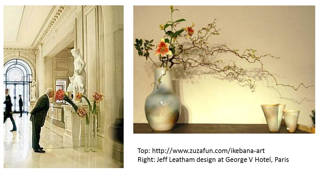
Floral arrangement has been a part of décor throughout history. Today we draw from our past knowledge employing the prominent elements used by ancient cultures. As far as Egyptian times we find that flowers were used based on their meanings in coordination with the religious events. In Greek times foliage was presented to athletes and at military triumphs. During the renaissance the traditional arrangements were further developed using varieties for their color contrast, usually in stunning vases with cone-shape arrangements. The Asian cultures have certainly had an influence in today’s florist, ikebana arrangements originated in Buddhist times as a practice of spiritual meaning, careful to maintain life they aimed at appreciating nature from the stems to the blooms in a minimalistic way meeting certain geometric margins.

Sculptural, contemporary expressions of art are evident in the styles of today’s recognized floral artists. Above are arrangements of Jeff Leatham, known for his hotel works in Europe, his signature leaning flowers are gravity-defying, impressive and structurally innovative. Rebecca Thus, recognized for her great designs and her work as style director for Martha Stewart, has pushed her abilities into many areas of art and décor, her table settings are exquisite. The ikebana arrangement by an unknown artist is naturally stimulating.
The experts say constantly have flowers in your home to naturally mange your moods, and for receptions as a symbol of generosity and welcoming host. They recommend using a variety of pots and vases; any container you can find around the house is great for holding everyday flowers. We love these vintage pots which you can dig up at your local antique store.
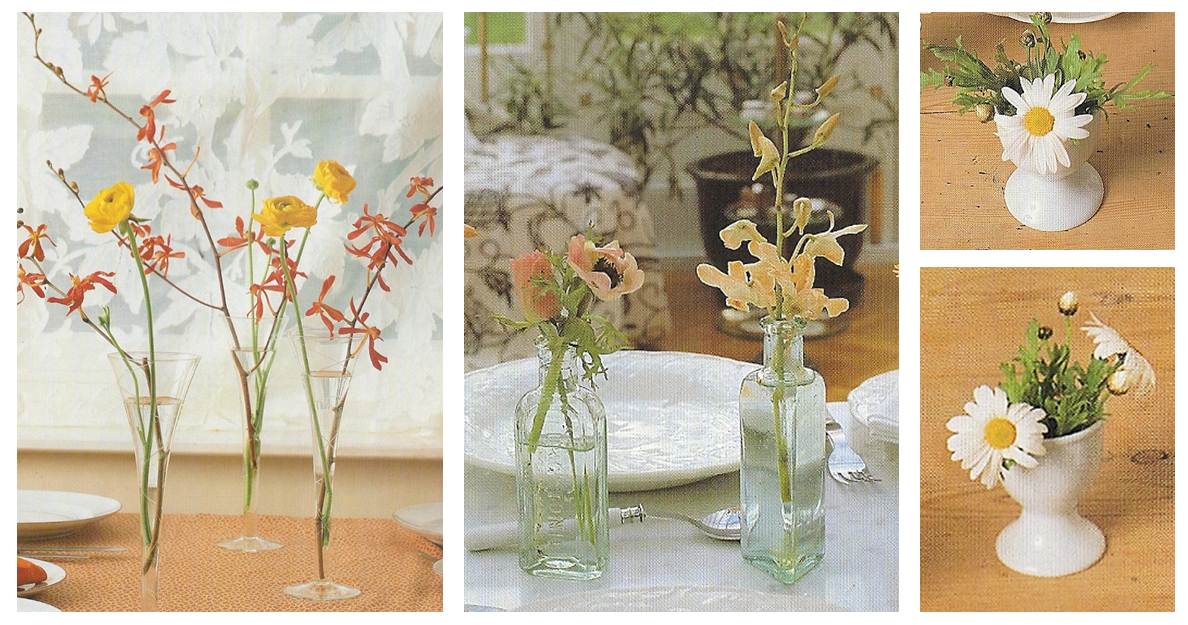


A tip for or do-it-your-selfers, when setting a spontaneous diner table be mindful of proportion, number of guests and theme. A floral arrangement may add contrast to your room or they can coordinate with your party décor, don’t allow them to fade out, they are there to grab the attention. If on a side table use a vase/pot and an arrangement with volume (tallness/thickness) in proportion to the size of the table and the space it is in.


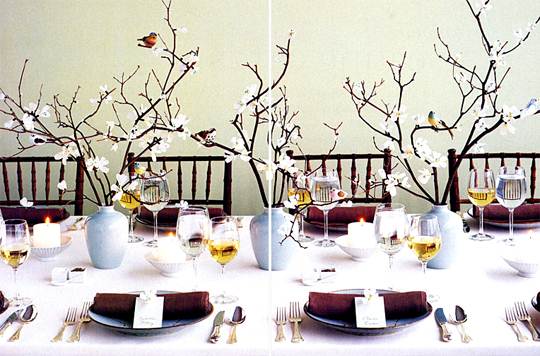
In the table setting above with small single floral arrangements and staggered with candles, the designer makes them a focal point by making everything else a neutral tone. The green monochromatic party uses medium size bouquets with lots of volume and pink accents to stand out from the décor. Below is a lighter arrangement that uses white vases with white flowers on a white table cloth perfectly contrasted with scrawny cherry blossom stems that create organic movement and whimsicality.

We encourage you to use creativity when decorating; anything can be an accent whether is dry, live, fruits, vegetables, anything goes. Experiment and “TRUST YOURSELF”.
Although most of our pictures are from Google Images and our own, the following is a list of resources related to this blog;