5 Key Elements That Define Contemporary Interior Design

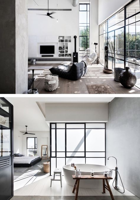
If your interior decorating sensibilities are marked by the use of modern and minimalist things, you are unwittingly a follower of the contemporary style. While many consider this style to be cold and lacking warmth, modern homes with contemporary interiors are anything but that. They are warm and welcoming without being too stuffy and dingy. Defined by a sense of subtlety, simplicity, and elegance, this style focuses on the space rather than the things in it.

Here are some intrinsic elements that lend a space the contemporary touch:

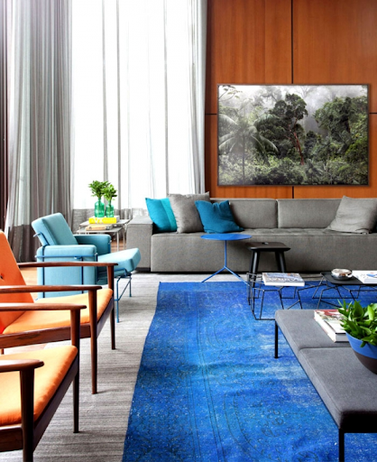
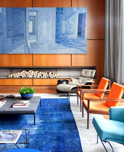
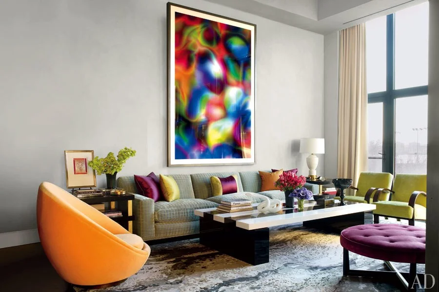
1. Clever use of color

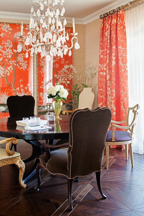
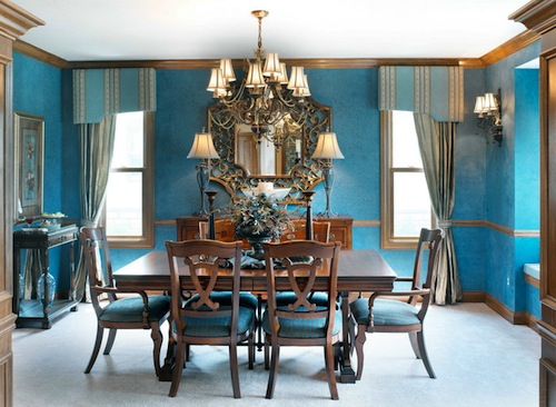
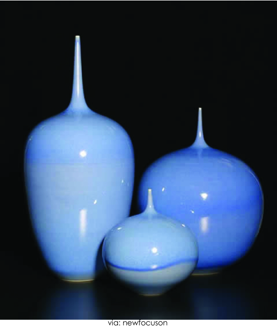
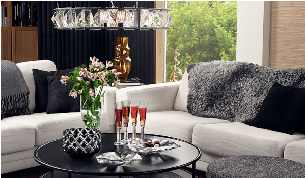
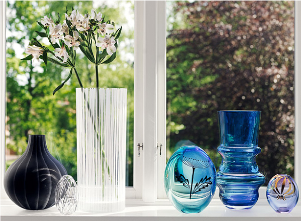
Contemporary style interiors are bathed in muted neutrals, along with black and white. They make use of a sophisticated color palette to create a space with a dynamic atmosphere. Bold. Vibrant colors are used to punctuate the neutral tone for a touch of freshness.

2. Blend of textures and materials

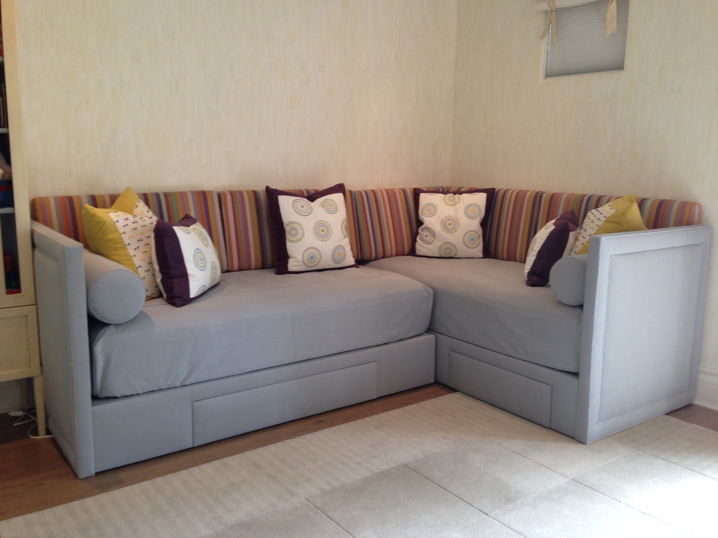
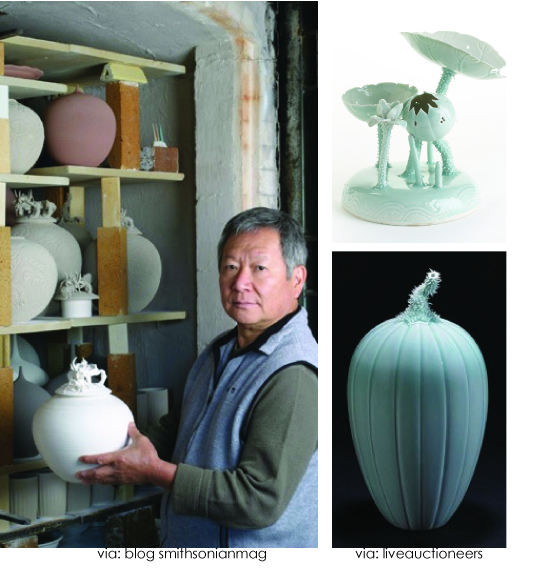
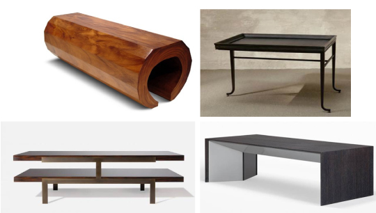
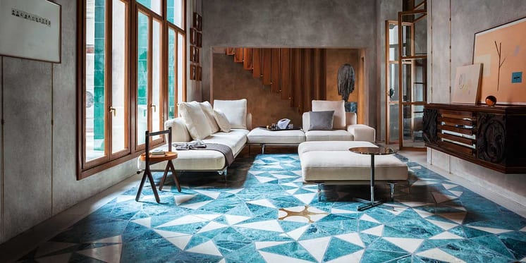
The ambiance of space is largely influenced by the textures. Contemporary home designers gravitate towards mixing different textures and materials to keep the space from looking too monotonous. For instance, elements like furniture pieces with a live edge can be matched with neutral-toned upholstery to make space look minimal yet warm.

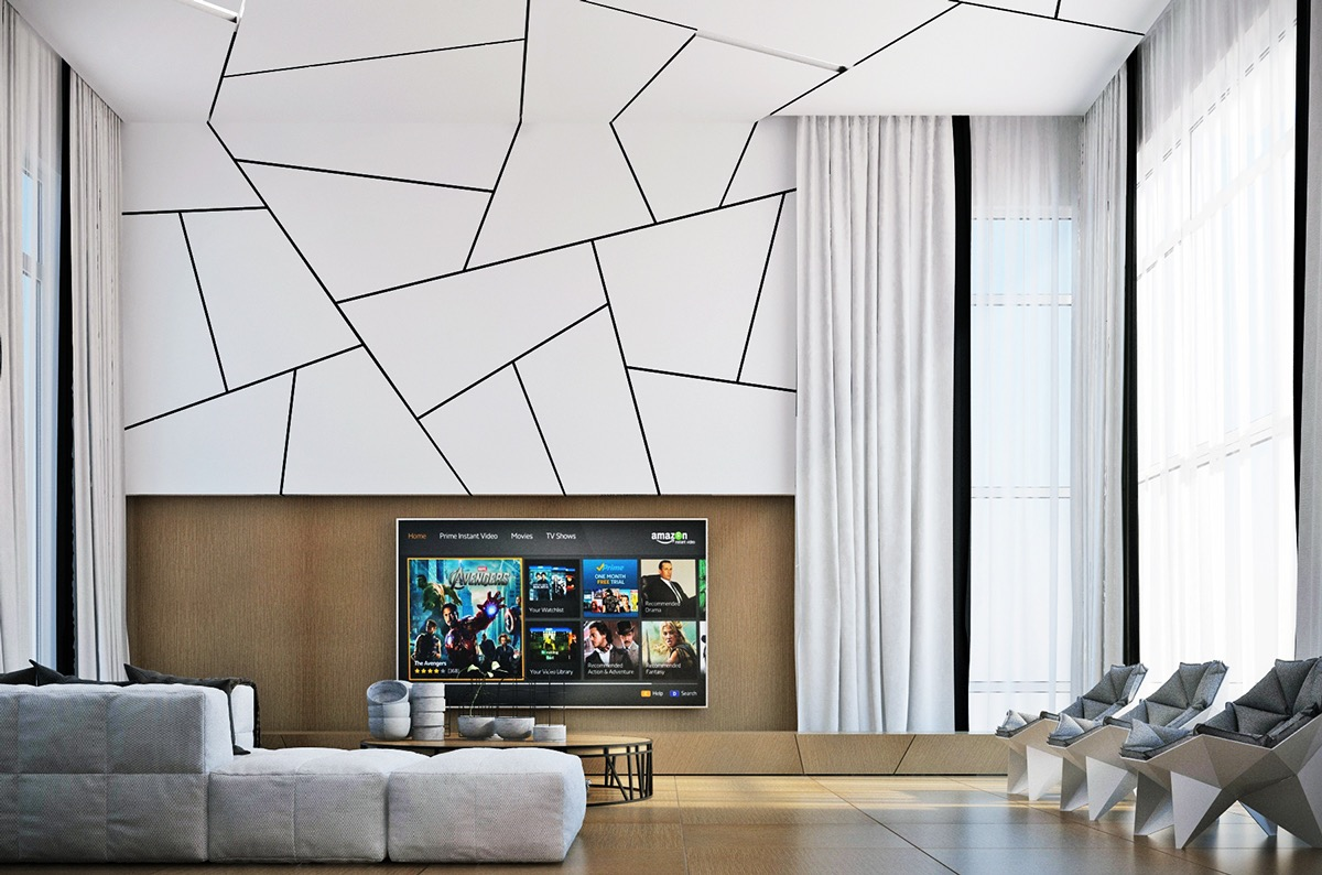
3. Simple shapes and crisp lines

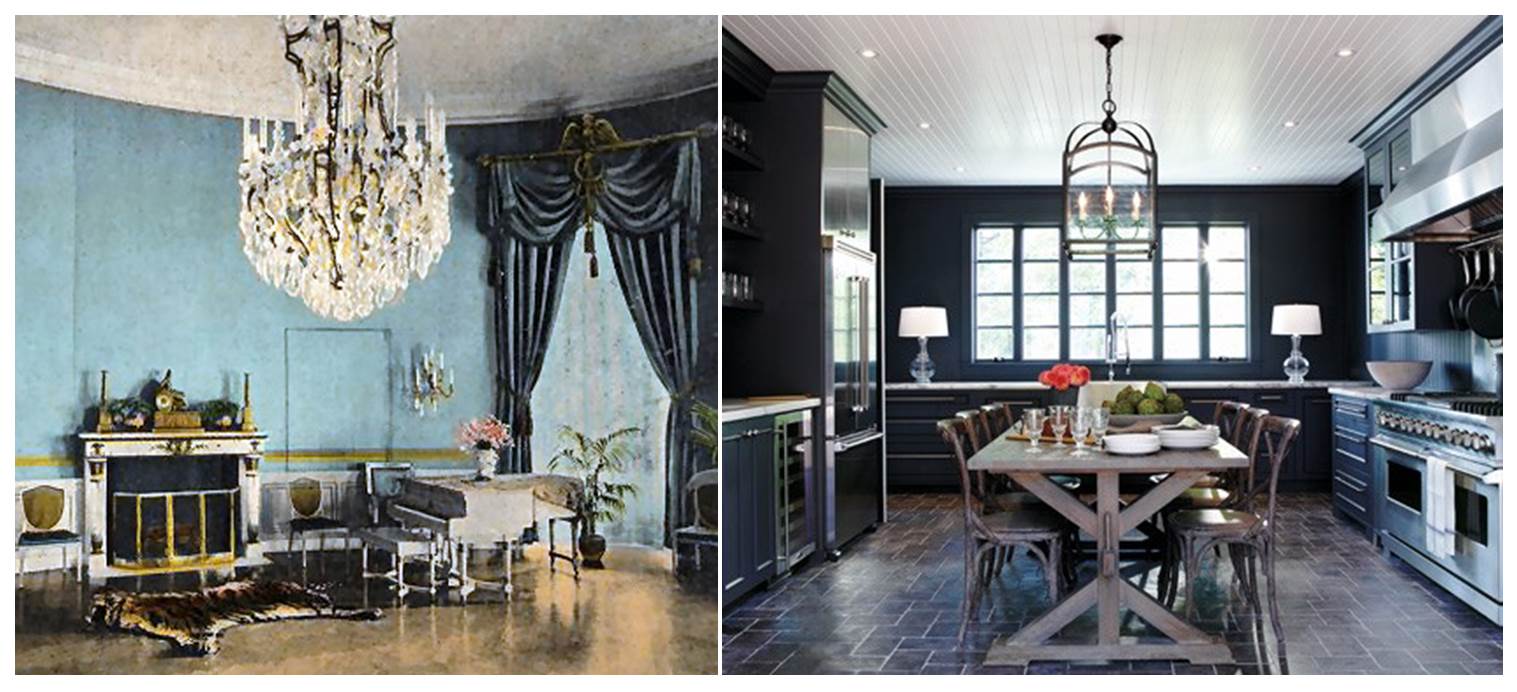
Some contemporary interiors call for angular, geometric shapes while some are more suited for soft and curvy shapes. However, when it comes to lines, they should be strong and crisp. High ceilings, big, bare windows and the use of bold color blocks are ways in which strong lines are achieved in contemporary spaces

4. The juxtaposition of industrial and natural elements

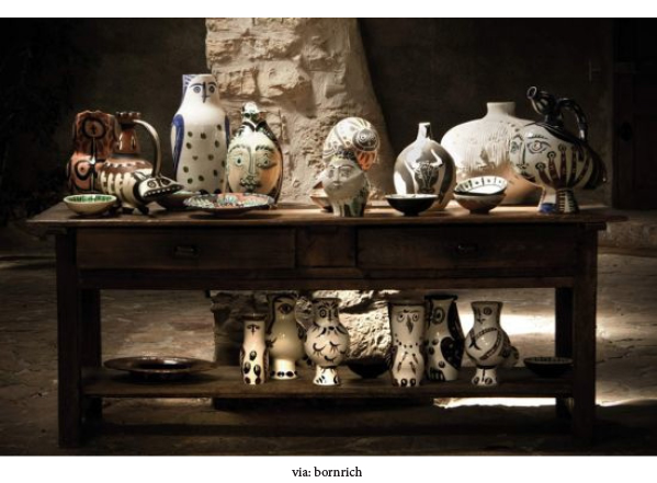
In contemporary interiors, it is not completely unusual to see the use of an assortment of elements, such as metal pipes paired with polished wood. Even though the tough industrial decor of the past few seasons has given way to softer styles, blending the two is a great way to add some interest to space.

5. Open designs

If you want to create a sense of openness and spaciousness in your house, the contemporary style is your best friend. Large, open spaces that seamlessly flow from one room to another come together to create a homogeneous whole. The use of large windows adds to that aura by bringing in plenty of natural light, which eliminates the need for artificial lighting during the day.


When making interior design choices, it is ultimately your personality and aesthetic sensibilities that should matter. Sure, that can seem difficult when you are not sure what you want. We, at Avanzato Designs, can help you find your style. We are a luxury interior designer in South Florida. Contact us to set up a consultation session !

Playing With Colors in Traditional Interior Design

Traditional interior design has elements that are firmly anchored in the past, with the vibe steeped in nostalgia and sentimentality, but that does not mean that you cannot have fun with it. While the idea of “traditional” may conjure images of a dated, boring space dotted with antiques and historical paraphernalia, in reality, it allows for much more. You can play with classic designs and more importantly, bold, vibrant colors. The colors in traditional interior decor provide balance and harmony. Instead of an overwhelming presence, they offer a pop in the space while also complementing the lighting, furniture, and other features.

It's A Boy!

An atypical splash of color for a growing boy’s room. Statistically, boys prefer an interior with blue and green colors—but who is to say boys are not partial to the other colors on the spectrum?

This combination of fabrics is impartial towards color, sex, or time. It is designed to depict the joy of life in a setting that adapts to a baby boy’s changing moods and humors.

This fabric combination has a story behind it: when we started an interior design project in Miami, Florida for a young couple with a three-year-old daughter and a boy “on the way.” Plans were made for a total renovation of their house on the Miami waterfront with one room assigned for their daughter and another one for the baby boy.

Keeping in mind kids grow so fast, the nursery was designed for the transition from baby to toddler and from toddler to child, so we used a palette of soft muted yellows. The interior design concept we applied was subtle with touches of whimsy. We added hand-painted texture to the walls, and the ceiling is an interior design master piece depicting little stick-figure boys doing different activities like riding a bike and sailing, etc. Young and old alike enjoy finding the stick figures throughout the painting.

As the little boy outgrew his crib, a pair of custom beds was made in an L-shape keeping the room open allowing for ample play space and for little guests to spend the night in the second bed. The frames were upholstered in a heavy silvery-blue woven fabric which will last for years of boyish use and will appeal to boys no matter the age. For the cushions and the pillows we used the fun patterns as they add a splash of color without taking away from the rest of the décor and the painted ceiling. Conveniently the beds can be updated effortlessly simply by chainging the cushions with a color and pattern appropriate for the age while the understated background colors will transcend the trends.

  1. COLLIN, 10 / SACHO
  2. 30691-410 / KRAVET
  3. MILLSTONES, LEAF-BLUE-MAUVE / LEE JOFA
  4. PRIMA ALPACA, MULBERRY / SANDRA JORDAN
  5. PRIMA ALPACA, DAFFODIL / SANDRA JORDAN
  6. BOW TIE, GREEN-YELLOW-INDIGO / LEE JOFA

Edwardian Edge

Adding An Edwardian Edge To Your Dining Room

A time of grandiose and splendour, the "Belle Epoque" as it was also known may have been short-lived but it brought with it a breath of fresh air. Fresh air that can be easily applied to your home with just a few key changes.

Period interior design is very on-trend at the moment and Edwardian style provides you with the opportunity to achieve an alternative look in your home's interior. Should you be choosing to transform your home, we believe the dining room is an excellent place to start. In the past there was a significant focus on mealtimes, so the dining room was a focal point of the home, follow our tips below and add the Edwardian experience to your own dining room.

Furniture

Usually reproduction pieces, Edwardian furniture was known for reviving styles from previous eras and was largely an eclectic marriage of styles and influences. Whether you choose baroque, Art Nouveau or Tudor pieces, the key thing to look out for is furniture that is smaller and less bulky. Edwardian furniture was known for being a departure from the large, heavy and formal Victorian furniture that preceded it.

For a truly Edwardian look, consider furniture made from mahogany or lighter materials such as wicker or bamboo.

Flooring

For an authentic look in any interior, choose highly polished wooden floors that are stained with an oak coloured varnish.

Wallpaper

When it comes to wallpaper, choose a design that adds a breath of fresh air to your interior. Perhaps consider paper that features floral interior designs such as roses, wisterias or sweet peas, or perhaps a striped design. When it comes to wall interior design, a key Edwardian look was to break up the wall with a dado rail. Perhaps choose to emulate this and paper half the wall with a patterned design and paint the rest of the wall.

Colour schemes

Continuing the floral theme, choose pastel colour schemes and floral colours. Think lilacs, leaf greens and primrose yellows.

Lighting

Electrical lighting was relatively new in the Edwardian period and therefore was designed to be grand. Fabric lampshades with frills and tassels, smoked glass and ceiling roses are all very true of the period.

Heating

Again still a relatively new innovation, radiators were a big deal during the Edwardian period and were designed to be a talking point of the home. Take inspiration from these reproduction cast iron radiators and choose updated colours to contrast your space. These reproduction radiators stay true to Edwardian designs but are equipped to modern plumbing and interior design standards.

DESIGN TRENDS: Winter collection

We’d like to share this work of art as an example of an intellectual trend of our current times rather than a fashion trend. Shoes are an everyday item but in Radevich’s world they are a canvas for profound expression.  This shoe collection is an amazing accomplishment that transcends the fashion and design world. By compiling intense amounts of information in a sculpture of an item that already has a purpose, Radevich seeks to ‘define our walk through life’. This diligent and optimistic designer sculpts shoes to state a global problem, a historic account, or a personal message.

As a history lover inspired by ancient historic accounts, Anastasia Radevich native of Belarus devised a collection of feminine shoes remembering lost cities of the past. Her confident designs comment on the decaying of our environment and reflect on the current threats to planet earth, and hopefully instill a proactive view on the future state of the world.

We interviewed Anastasia to get an expanded view of her collection and this is what she said

What did it take to discover the possibility of bringing your true expressions as an artist into your passion for shoes?

I grew up in a family of shoe designers and experimented with shoes since childhood. Shoe craft became a canvas for ideas because it is something I know very well.

What inspired you to do the "Lost Civilization" collection in 2012?

The Lost Civilizations came to me as a wave of already accumulated ideas and world vision. For quite a while and until today I am keen on philosophy, history (narrated from different angles), anthropology and have noticed patterns how civilizations grow and descend, also investigated the “untraditional” story behind Egypt and the real timeline of the history and evolution. It wasn't hard to draw some parallels with modern state of things. And based on the research I came to the conclusion about the coming future J  All those ideas were brought into the collection…

Do you hand-model/carve the impressive heels of your shoes and 3d print?

You are correct, I sculpt the components and my husband helps me with technical development

Which shoe is your favorite? Why?

I love the “Galvanica” pump from the “PAST” of Lost Civilizations as it gave me a wonderful experience of meeting with extraordinary people while developing it. Making it was a very beautiful journey that translated into the shoe

The platforms are solid in character and the upper shoe has more emotional qualities. How challenging is it to recreate an item that is conceived as heel and shoe?

To be honest, I don’t divide the shoe into upper and lower -it is one “organism”. It is all “cooked” intuitively.

I understand that the message of the collection is to analyze the current state of the earth. What overall impact do you dream your works of art will have in our society?

I don’t have high hopes of stopping some environmentally wrong projects to go through. But I am trying to influence on the subconscious of people, hoping this will echo somewhere, somehow…

Do you plan to further in the preservation subject, or do you have a new collection in the works?

There is something amazing boiling at the moment and I cannot say yet as it is rather fragile, but I cannot not hide a witty smile!

Pick of the Month: Sketches Around Peru

I thought I’d share this small study I found at the bottom of my drawer. A series of black and white drawings which start with a very linear and architectural perspective and evolve into a loose freehand sketch. Fresh out of school I found myself traveling through South America in ancient mystic lands of far way (for a European at least). The media is pen and marker, and the subject is the indigenous people of Cusco, Peru. Their fairly untouched culture reveals a subtle connection to the ancient lifestyle of Egypt suggesting the lands most have been joined at some point. The woman at the lake is standing on a Uros boat much like the Egyptians used long ago for transportation, at Lake Titicaca layer upon layer of dried reeds have been shaped into man made islands where they live work and play (talk about Lake-front living). These studies although somewhat abstract show daily life in the mountainous region of Peru.

Palette Trends: Creamy Fresh

Today’s palette is a composition of comforting vanilla and refreshing soft mint, perfect for a "get away from the stress of daily life" room, to recoup, recharge and indulge in total peace. Also ideal for a guest bedroom, although guests may feel so comfortable they may not want to leave...

This color combination is very pleasant because subconsciously it reminds us of soft flavors and the subtleness of nature.  As part of the green family 'mint' is a restful hue promoting concentration. 'Vanilla' has the properties of both clean-white and happy-yellow, favorable when making a soft palette. Inspired by the velvet checkered pattern I like to keep it in the family and contrast with bronze, think of toasted almonds. Lastly add a soft touch of blue-violet, a stable and relaxing color like its blue parent.

A great example of a calming mint palette is this bedroom by Tobi Fairley. It is both romantic and yummy at the same time, much like mint chocolate after dinner.

  1. LUX, SLATE / LARSEN
  2. BAMBOO FRIEZE, SKY / KRAVET
  3. VELVET / ZOFFANY
  4. YORK, 101 / CHRISTIAN FISCHBACHER
  5. MEPHISTO, SOLID TAFFETA / CREATIONS METAPHORES
  6. THAILANA, ALICE BLUE /LARSEN
  7. CAPULET, OPALESCENCE / GP HOLLY HUNT
  8. MEDIUM WALNUT WOOD FINISH
  9. STELLA, WHITE GOLD / GP HOLLY HUNT
  10. MERCURE, VERT MING / CREATIONS METAPHORES

Arcadian Home Guest Post - Dining Rooms

Hello, everyone! It’s Marie here with a guest post from Arcadian Home blog, a fabulous place to find interior design inspiration including great decorating ideas for everything from beautiful folding screens to glittering traditional chandeliers.

Those of you who are regular readers of Avanzato Design blog are already familiar with the always interesting and informative monthly palette trends series. Inspired by Vincenzo’s obvious love of color, we've pulled together eight of our favorite color-infused traditional dining rooms to share with you today. Please enjoy!

~ Marie

A traditional dining room with warm wood flooring is exquisitely dressed in soft yellows and accented with inviting lime-yellow end chairs.

Warm buttery yellow walls create an appealing background for this cheerful and slightly feminine traditional dining room. Drapery panels in pretty pink hues work beautifully with a large floral pattern on the chairs. Charming table decor gives this space a Sunday brunch feel.

Minty greens and blues bring a fresh modern take on traditional with a Chinoiserie twist. The vibrant wall color works beautifully with the pure white woodwork above and below.

Warm brown tones pair work well and tone down the bright orange fabrics in this updated traditional dining room. A beautiful mix of dining chairs includes two in chocolate brown velvet.

Brilliant turquoise brings this spacious dining room to life. Using so much color might seem like a bold design choice, but works here without overwhelming the room.

Wallpaper in white and pink on green brings a lively feel to this otherwise sedate dining room. The pretty traditional pattern creates a beautiful background for the wood furnishings in this space. Rather than the expected buffet lamps on the antique sideboard, silver vases of blooming branches mimic those in the wallpaper.

Vibrant pink is exquisite in this beautifully appointed traditional dining room. The deep pink hue is at once powerful and appealing. It must look even more stunning after dark in the glow from candles, wall sconces and chandelier.

This purple-infused dining room is beautiful on its own, but becomes an extraordinary space at the holidays with the addition of red decorative elements. If this room is any indication, purple and red seem to have a very companionable relationship. Images 1 | 2 | 3 | 4 | 5 | 6 | 7 | 8

What do you think of these traditional dining rooms? send us your comments and discover more home decor, accessories, and modern pendant lights at our blog!

Secretary Desks

The secretary desk, also known as a “secretaire”, is made of a base of wide drawers topped by a desk with a hinged desktop surface, which is in turn topped by a bookcase usually closed with a pair of doors, often made of glass, for those who perhaps have not seen one before, the secretary desk in a "mélange" of furniture pieces made up of a mix between a commode-dresser, a slant top desk and a book case first became popular around the 17th century. As the design began to evolve and adapt to modern day amenities, the slanted writing surface ultimately was replaced by a flat pullout design that is better suited for computers and keyboards.

Selected antiques and custom furnishings can be very decorative and because of its popularity, the "secretary" (not to be confused with the person that takes notes) has grown to be the most common. Today, one can find an endless array of reproductions from a string of manufactures and designers. Below is a custom made secretary that I created for a recent bedroom redesign. My client’s wife wanted a functional but yet beautiful piece of furniture for her bedroom that she could use to organize stationary and personal items.

Secretary desks are great for storage; they’re versatile enough to fit into almost any home and can be tailored to fit your design aesthetic. In addition to serving as a storage unit and desk space, the secretary can also be used as a display case. By throwing open the top tier one can easily showcase treasured collectibles while keeping clutter neatly stored away.

DESIGNER'S PICK OF THE MONTH: Picasso Pottery

For this week’s “Designer’s Pick” we've chosen to introduce a beautiful collection of ceramics designed by Picasso. Picasso loved the art of pottery, so much so that he named his son Claude after the patron saint of potters. Taking up the craft as a means of experimenting with a new artistic medium, the design process was seen as a challenge and way for Picasso to express his artistic passion. He painted an array of pieces, from plates to vases, which were often built up by molding, gouging and framing the clay while it was still pliable.

Stashed away, Picasso kept most of the works of art for his own private collection, which were later passed down to his heirs. For this reason, the ceramic pieces were often overlooked and undervalued. The collection has only started to gain popularity over the past twenty years, and today it consists of thousands of unique works. Take a look at a selected few pieces.

PALETTE TRENDS: Blue & Lemon Green

A soft, airy and placid combination is today’s fabric palette. It is hard not to like blue it is also hard to ignore as it surrounds us in our every day life. Blue is perceived as a color of stability, in light shades as having a calming effect. Using different textures in blue creates an interesting yet peaceful variation. Compensating the excitement that light-blue lacks, lemon green accents add rhythm to the palette. Although our example is a soft version of yellow-green it is a very vibrant color, literally! As experts say it reflects more light than other bright colors producing a stronger vibration. It is uplifting and promotes creativity but may border on being fatiguing or over stimulating. But no need to fret; simply use lighter shades on large areas reserving the stronger versions of it for accents. In a large room a sofa may be an accent piece much like a throw pillow in a smaller room. Knowing the implications of color helps us create rooms that are uncommon, pleasant and beautifully combined. In short this palette marries two opposite color personalities to create a complete environment. Below are designs that embrace using such stimulating color with confidence. Bravo!

  1. CLEMENCE, COBALT-LETTICE /HILL BROWN
  2. CARREG, LIME-CREAM / SANDERSON
  3. SOFA ANIS / PIERRE FREY
  4. PATOLA, CITRON / HILL BROWN
  5. MEPHISTO, BLANC /CREATIONS METAPHORES
  6. COMO, COMO /D.G. OSBORNE & LIITTLE
  7. CALLAS, 15 /CREATION BAUMANN

Fabrics by Daniel Fragata /design intern

Text by Andrea Chery /design associate

Cliff Lee - Porcelain Pottery

I came across a piece of Cliff Lee’s work while traveling and was instantly drawn in by the sensual shapes and delicate details that are strongly influenced by his family's Asian roots. Born in Vienna, Austria in 1951, Lee moved to the United States in 1968 to attend the college where he earned a degree in biology and went on to specialize in neurosurgery.  Lee took his first ceramic class as a way to relieve some of the stress brought on by his demanding career. As the weekend activity slowly began to evolve into a deeper passion he enrolled in a ceramic class at the University of James Madison in Harrisonburg, Virginia.

In 1993, President Clinton invited Lee to showcase his vases with the White House Collection of American Crafts that was set to tour the country. Today his pieces can be found in the Renwick Gallery, Mint Museum of Craft and Design and Racine Art Museum as well as the White House Collection of American Craft.

Lee currently lives in Pennsylvania where he now spends most of his time in the pottery studio creating works of art with rich detailing, character and a sense of history.

Coffee Tables - Avanzato Design

The coffee table, a staple piece in any living room, became popular during the Victorian era when tea-time was a celebrated afternoon activity. Over the years, the essential use for the coffee table began to evolve. Today the furnishing is incorporated into modern day settings for a variety of reasons. They are a wonderful place to display our objects, harmonize our seating arrangements and bring a layer of design into our living spaces.

Coffee tables should be thought of as functional works of art. They can be used to communicate our style while creating a platform to showcase our passions. Whether you’re feeling modern, traditional or classically chic, accentuate your decor with a coffee table that speaks to you and your design personality.

Depending on your selection, a coffee table can be the grounding center-piece to your living space. Before finalizing your coffee table decision, think about its function and what purpose it will serve. Dress it up and make it a true reflection of your design aesthetic by adding flowers, vases, books and other ornaments. Incorporating an eclectic mix of pieces will allow you to create a unique arrangement for both you and your guests to enjoy.

A truly beautiful coffee table should be able to create a striking visual when standing alone. The staging of your coffee table should never over power its true purpose. Always leave enough surface area for useable space.

PALETTE TRENDS: DEEP BLUE SEA

Deep blue sea …is a very dark color, but it has an exceptional richness that encompasses power, abundance, strength, and the imposing presence of royalty. Its deep character yields a fine contrast with any light crystal color such as sea foam, mint green, aquamarine. In this palette we have a deep blue velvet (#1) as the main fabric, its embossed floral pattern adds a subtle elegance to the already shimmery hand of velvet. Such enigmatic fabric is perfect for a focal point piece, a sofa for example. Add a pop of color with silk pillows and juxtapose it with additional pieces upholstered in the color family accents such as striped jade, light blue, aqua and sand. We added a large printed silk (#3) for curtains to continue the drama to the walls, it has a light background so it won’t be visually bulky, it brings rhythm by braking away the rigid stripes. It introduces a little vibrant rose to the composition for contrast. Compliment it further with a kidney pillow or an accessory in a rose tone. The contrasts and the rhythm between the patterns is gauged to deliver a brave yet welcoming space whether it’s a living room or a more intimate space.

Below you will find some examples of courageous design using dark blue as the center of their color scheme. The first image is the Blue Room in the White House as it was around 1903 during President Teddy Roosevelt’s administration. The second image is a daring kitchen showcasing a contemporary dark blue with deep earth tones and contrasting white solids.

  1. PEONIS, 50 /JAB
  2. BACKSTAGE, MINERAL / KRAVET
  3. LE CABINET CURIOSITES, ROSE /MANUEL CANOVAS
  4. JULES, PIVOINE /MANUEL CANOVAS
  5. ENGLISH BURI WOOD FINISH /NANCY CORZINE
  6. QUEENS, SPRINGFIELD /SHYAM AHUJA
  7. ILLUSION, PARIS BLUE /GREAT PLAINS HH
  8. SOIREE, MIDORI /GREA PLAINS HH
  9. MARIN, NATTIER /MANUEL CANOVAS
  10. NATURAL OAK WOOD
  11. ROYAL FLUSH, BLUE CHIP /GREAT PLAINS HH

Reference;

http://www.whitehousemuseum.org/floor1/blue-room-history.htm

http://www.cococozy.com/2010/12/color-watch-dark-rooms-pitch-black-and.html

Alex Turco & Avanzato Design

Create an element of visual interest in your outdoor space by introducing a focal wall with a creative design and pop of color! We recently teamed up with Italian artist Alex Turco to develop a stunning decorative panel for an exterior backdrop in an outdoor garden. The large panels face the canal, positioned in a way that allows viewers to enjoy the artistic image from both the boat and garden. The rendering, a depiction of a sensual mermaid, was designed using a photographed image that was then skillfully layered using multi-media graphics. Once the illustration was completed, rock crystals were added to create visual depth and dimension. The end result is a beautiful one of a kind rendition of a free floating form surrounded by water and cascading crystals. When the sun hits the stones, the light is reflected onto the backdrop creating a dramatic eye-catching effect.

Franz Xaver Messerschmidt

Born in the village of Wiesensteig in what is now part of southern Germany, Baroque sculptor Franz Xaver Messerschmidt created a series of portraits that were undervalued and rejected as unrefined works of art during the time of their creation 200 years ago. The collection, made up of faces carved in alabaster or cast in lead and tin alloy, was thought to be the workings of a “madman” as their expressive nature was unlike the standard designs of the time.

Wiesenteig always maintained a passion for the arts. At the age of 18, he moved to Vienna where he focused on refining his craft at the Academy of Fine Arts. During his early years, Messerschmidt’s commissioned portraits all depicted a style of stoic blankness, a classic pose similar to that often associated with the ancient rulers of Rome.

As time progressed, Wiesensteig began to show signs of mental strain. After being passed over twice for a position as a professor of sculptor, he sold his home and moved to the Slovak Republic where he lived alone and began to embrace the life of a hermit.

Amid his time alone, Messerschmidt began to develop a slight obsession with dramatic facial expressions. His designs are typically shown with tightly closed lips encompassing nothing more than the head and neck. This forces viewers to really focus on the carved details of the muscles and stretched skin.  200 years ago these heads were dismissed, however today Messerschmidt has become famous for his remarkable series of “Character Heads.” The modern creations have become a favorite amongst art lovers around the world.

Images via:

nedbajic.wordpress.com, common.wikimedia.org, laboiteverte.fr, nosideuo,blogspotcom, mikyag.blogspot.com, cultureheroesinc.blogspot.com

Designer's Pick - Orrefors Glass

Why not add a touch of elegance to your decor by incorporating a stunning glass design from the Orrefors collection? Showcasing the essence of classic Scandinavian beauty, these glassware assortments feature both utility glass and glass art, all made from polished crystal. The history behind the collection dates back to 1898 where, in Smaland, Sweden, expert Orrefors glassmakers worked alongside some of the top designers in the area to perfect their craft while developing new and innovative techniques and designs. Today the Orrefors team is made up of five designers, each of whom works to interject their own creative vision into the timeless and well refined collections that Orrefors is known for.

Look and be inspired by how the crystal glass adds a layer of sleek sophistication into each of these interior spaces.

Designer's Pick - Mark Voris

Mark Voris
Mark Voris
Mark Voris
Mark Voris

This beautifully painted landscape rendition showcasing the aura and richness of Tucson, Arizona is this week’s “Designer’s Pick.” I have not always been a fan of the western type of art, but the hand of Mark Voris captured my eye because of its unique “Van Goghesque” painting technique.

An international artist born in Franklin, Indiana, Voris later moved to Arizona in 1925 where he attended the University. Soon after graduating, he started to display an interest in various artistic outlets including printing, photo engraving and advertising. Through trial and error, Voris became a self taught well respected artist. The above painting is one from his collection that was designed using an impasto technique, a process in which paint is thickly laid on the surface of the canvas leaving the knife and brush strokes visible and layered with texture. We’ve also included a few more pieces from his extensive collection that display the same layered painting technique that the artist has become so famous for.

Mark Voris
Mark Voris
Mark Voris
Mark Voris

PALETTE TRENDS: Vibrant Colors

photo 1.2
photo 1.2

We have been gathering our fabrics and we are back with something great this month. We are featuring a mix of Manuel Canovas’ newest collection that lightens up our design world. Indeed, a strong statement is a palette of vibrant colors one next to another. This composition is made of equally saturated colors, any of which can dominate the palette. Its success is in the repeated use of all the colors in small amounts. For example by adding a large sofa in the fuchsia geometric fabric the palette becomes harmoniously fuchsia with a colorful framework. The options are endless!

In the printed designs of head designer Ariane Dalle the Uzbekistani women are working on their embroideries in the process of suzani making, everything from carrying seeds, hand weaving and nursing their children is depicted, as if paying homage to the labor of the women behind a craft which is basic yet becomes a sophisticated way to dress up our homes and ourselves. Dale’s designs celebrate the art of fabric making with a wide cultural perspective and a refined French spirit. This ensemble reminds me of certain indigenous cultures I have visited whose bold use of color in their elaborate prints and weaves embodies the artistic nature within humans that transcends culture, language, education or technology.

Color is dear to my heart because it can express a range of things from; geography, affluence, to personality and emotions. The indigenous people of San Cristobal, Mexico and Antigua, Guatemala (pictures below) engage colorful designs in their clothes and accessories in their everyday life, which are amazingly similar to those from Asia proof that we are undeniably connected thru color, art and nature.

photo 2
photo 2
  1. VOYAGE EN CHINE, TURQUOISE /MANUEL CANOVAS
  2. KERALA, ROSE INDIEN /MANUEL CANOVAS
  3. EBBTIDE /SHERWIN WILLIAMS PAINT
  4. MONCEAU, TURQUOISE /MANUEL CANOVAS
  5. NURA, CITRON /MANUEL CANOVAS
  6. FABULOUS GRAPE /SHERWIN WILLIAMS PAINT
  7. FOCH, CARDINAL /MANUEL CANOVAS
  8. BELLA, AQUA /MANUEL CANOVAS
  9. EXUBERANT PINK /SHERWIN WILLIAMS PAINT

RESORCES:

Michele Nessen Mikulskis

http://lifepart2.com/day-of-the-dead-in-chiapas-near-san-cristobal-de-las-casas/

http://www.panoramio.com/photo/14149516

http://www.tropicaldiscovery.com/regional_info/antigua_tours/vacations.php

http://www.traveljournals.net/pictures/7605.html

http://mexicotoday.org/culture/san-cristobal-de-las-casas

James Emil Bisttram

James Emil Bisttram, a native of Hungary, moved to New York City with his family at the age of eleven. Growing up as a commercial artist, Bisttram began to tailor his craft, creating a unique and identifiable style after years of studying successively at the National Academy of Design, Cooper Union, the Art Students League and the New York School of Fine and Applied Art. His works are a mix of dynamic symmetry and creative compositions reflective of the cosmic abstraction trends of the time heavily influenced by artist such as Picasso and Kandinksy. Each piece of art would make a beautiful addition in any home where classic art is treasured.