Avanzato Design

PALETTE TRENDS: Blue & Lemon Green

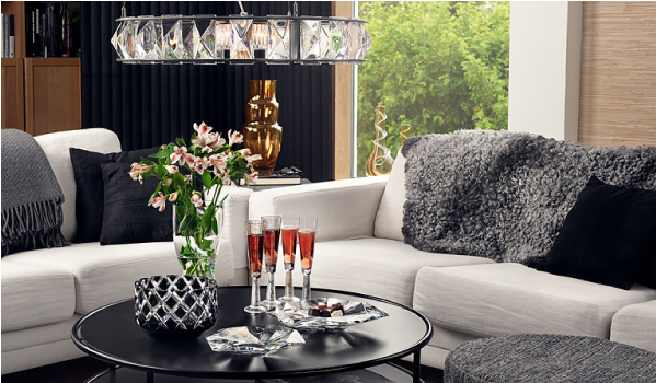
A soft, airy and placid combination is today’s fabric palette. It is hard not to like blue it is also hard to ignore as it surrounds us in our every day life. Blue is perceived as a color of stability, in light shades as having a calming effect. Using different textures in blue creates an interesting yet peaceful variation. Compensating the excitement that light-blue lacks, lemon green accents add rhythm to the palette. Although our example is a soft version of yellow-green it is a very vibrant color, literally! As experts say it reflects more light than other bright colors producing a stronger vibration. It is uplifting and promotes creativity but may border on being fatiguing or over stimulating. But no need to fret; simply use lighter shades on large areas reserving the stronger versions of it for accents. In a large room a sofa may be an accent piece much like a throw pillow in a smaller room. Knowing the implications of color helps us create rooms that are uncommon, pleasant and beautifully combined. In short this palette marries two opposite color personalities to create a complete environment. Below are designs that embrace using such stimulating color with confidence. Bravo!

  1. CLEMENCE, COBALT-LETTICE /HILL BROWN
  2. CARREG, LIME-CREAM / SANDERSON
  3. SOFA ANIS / PIERRE FREY
  4. PATOLA, CITRON / HILL BROWN
  5. MEPHISTO, BLANC /CREATIONS METAPHORES
  6. COMO, COMO /D.G. OSBORNE & LIITTLE
  7. CALLAS, 15 /CREATION BAUMANN

Fabrics by Daniel Fragata /design intern

Text by Andrea Chery /design associate

Cliff Lee - Porcelain Pottery

I came across a piece of Cliff Lee’s work while traveling and was instantly drawn in by the sensual shapes and delicate details that are strongly influenced by his family's Asian roots. Born in Vienna, Austria in 1951, Lee moved to the United States in 1968 to attend the college where he earned a degree in biology and went on to specialize in neurosurgery.  Lee took his first ceramic class as a way to relieve some of the stress brought on by his demanding career. As the weekend activity slowly began to evolve into a deeper passion he enrolled in a ceramic class at the University of James Madison in Harrisonburg, Virginia.

In 1993, President Clinton invited Lee to showcase his vases with the White House Collection of American Crafts that was set to tour the country. Today his pieces can be found in the Renwick Gallery, Mint Museum of Craft and Design and Racine Art Museum as well as the White House Collection of American Craft.

Lee currently lives in Pennsylvania where he now spends most of his time in the pottery studio creating works of art with rich detailing, character and a sense of history.

Coffee Tables - Avanzato Design

The coffee table, a staple piece in any living room, became popular during the Victorian era when tea-time was a celebrated afternoon activity. Over the years, the essential use for the coffee table began to evolve. Today the furnishing is incorporated into modern day settings for a variety of reasons. They are a wonderful place to display our objects, harmonize our seating arrangements and bring a layer of design into our living spaces.

Coffee tables should be thought of as functional works of art. They can be used to communicate our style while creating a platform to showcase our passions. Whether you’re feeling modern, traditional or classically chic, accentuate your decor with a coffee table that speaks to you and your design personality.

Depending on your selection, a coffee table can be the grounding center-piece to your living space. Before finalizing your coffee table decision, think about its function and what purpose it will serve. Dress it up and make it a true reflection of your design aesthetic by adding flowers, vases, books and other ornaments. Incorporating an eclectic mix of pieces will allow you to create a unique arrangement for both you and your guests to enjoy.

A truly beautiful coffee table should be able to create a striking visual when standing alone. The staging of your coffee table should never over power its true purpose. Always leave enough surface area for useable space.

PALETTE TRENDS: DEEP BLUE SEA

Deep blue sea …is a very dark color, but it has an exceptional richness that encompasses power, abundance, strength, and the imposing presence of royalty. Its deep character yields a fine contrast with any light crystal color such as sea foam, mint green, aquamarine. In this palette we have a deep blue velvet (#1) as the main fabric, its embossed floral pattern adds a subtle elegance to the already shimmery hand of velvet. Such enigmatic fabric is perfect for a focal point piece, a sofa for example. Add a pop of color with silk pillows and juxtapose it with additional pieces upholstered in the color family accents such as striped jade, light blue, aqua and sand. We added a large printed silk (#3) for curtains to continue the drama to the walls, it has a light background so it won’t be visually bulky, it brings rhythm by braking away the rigid stripes. It introduces a little vibrant rose to the composition for contrast. Compliment it further with a kidney pillow or an accessory in a rose tone. The contrasts and the rhythm between the patterns is gauged to deliver a brave yet welcoming space whether it’s a living room or a more intimate space.

Below you will find some examples of courageous design using dark blue as the center of their color scheme. The first image is the Blue Room in the White House as it was around 1903 during President Teddy Roosevelt’s administration. The second image is a daring kitchen showcasing a contemporary dark blue with deep earth tones and contrasting white solids.

  1. PEONIS, 50 /JAB
  2. BACKSTAGE, MINERAL / KRAVET
  3. LE CABINET CURIOSITES, ROSE /MANUEL CANOVAS
  4. JULES, PIVOINE /MANUEL CANOVAS
  5. ENGLISH BURI WOOD FINISH /NANCY CORZINE
  6. QUEENS, SPRINGFIELD /SHYAM AHUJA
  7. ILLUSION, PARIS BLUE /GREAT PLAINS HH
  8. SOIREE, MIDORI /GREA PLAINS HH
  9. MARIN, NATTIER /MANUEL CANOVAS
  10. NATURAL OAK WOOD
  11. ROYAL FLUSH, BLUE CHIP /GREAT PLAINS HH

Reference;

http://www.whitehousemuseum.org/floor1/blue-room-history.htm

http://www.cococozy.com/2010/12/color-watch-dark-rooms-pitch-black-and.html

Designer's Pick - Orrefors Glass

Why not add a touch of elegance to your decor by incorporating a stunning glass design from the Orrefors collection? Showcasing the essence of classic Scandinavian beauty, these glassware assortments feature both utility glass and glass art, all made from polished crystal. The history behind the collection dates back to 1898 where, in Smaland, Sweden, expert Orrefors glassmakers worked alongside some of the top designers in the area to perfect their craft while developing new and innovative techniques and designs. Today the Orrefors team is made up of five designers, each of whom works to interject their own creative vision into the timeless and well refined collections that Orrefors is known for.

Look and be inspired by how the crystal glass adds a layer of sleek sophistication into each of these interior spaces.

Designer's Pick - Mark Voris

Mark Voris
Mark Voris
Mark Voris
Mark Voris

This beautifully painted landscape rendition showcasing the aura and richness of Tucson, Arizona is this week’s “Designer’s Pick.” I have not always been a fan of the western type of art, but the hand of Mark Voris captured my eye because of its unique “Van Goghesque” painting technique.

An international artist born in Franklin, Indiana, Voris later moved to Arizona in 1925 where he attended the University. Soon after graduating, he started to display an interest in various artistic outlets including printing, photo engraving and advertising. Through trial and error, Voris became a self taught well respected artist. The above painting is one from his collection that was designed using an impasto technique, a process in which paint is thickly laid on the surface of the canvas leaving the knife and brush strokes visible and layered with texture. We’ve also included a few more pieces from his extensive collection that display the same layered painting technique that the artist has become so famous for.

Mark Voris
Mark Voris
Mark Voris
Mark Voris

PALETTE TRENDS: Vibrant Colors

photo 1.2
photo 1.2

We have been gathering our fabrics and we are back with something great this month. We are featuring a mix of Manuel Canovas’ newest collection that lightens up our design world. Indeed, a strong statement is a palette of vibrant colors one next to another. This composition is made of equally saturated colors, any of which can dominate the palette. Its success is in the repeated use of all the colors in small amounts. For example by adding a large sofa in the fuchsia geometric fabric the palette becomes harmoniously fuchsia with a colorful framework. The options are endless!

In the printed designs of head designer Ariane Dalle the Uzbekistani women are working on their embroideries in the process of suzani making, everything from carrying seeds, hand weaving and nursing their children is depicted, as if paying homage to the labor of the women behind a craft which is basic yet becomes a sophisticated way to dress up our homes and ourselves. Dale’s designs celebrate the art of fabric making with a wide cultural perspective and a refined French spirit. This ensemble reminds me of certain indigenous cultures I have visited whose bold use of color in their elaborate prints and weaves embodies the artistic nature within humans that transcends culture, language, education or technology.

Color is dear to my heart because it can express a range of things from; geography, affluence, to personality and emotions. The indigenous people of San Cristobal, Mexico and Antigua, Guatemala (pictures below) engage colorful designs in their clothes and accessories in their everyday life, which are amazingly similar to those from Asia proof that we are undeniably connected thru color, art and nature.

photo 2
photo 2
  1. VOYAGE EN CHINE, TURQUOISE /MANUEL CANOVAS
  2. KERALA, ROSE INDIEN /MANUEL CANOVAS
  3. EBBTIDE /SHERWIN WILLIAMS PAINT
  4. MONCEAU, TURQUOISE /MANUEL CANOVAS
  5. NURA, CITRON /MANUEL CANOVAS
  6. FABULOUS GRAPE /SHERWIN WILLIAMS PAINT
  7. FOCH, CARDINAL /MANUEL CANOVAS
  8. BELLA, AQUA /MANUEL CANOVAS
  9. EXUBERANT PINK /SHERWIN WILLIAMS PAINT

RESORCES:

Michele Nessen Mikulskis

http://lifepart2.com/day-of-the-dead-in-chiapas-near-san-cristobal-de-las-casas/

http://www.panoramio.com/photo/14149516

http://www.tropicaldiscovery.com/regional_info/antigua_tours/vacations.php

http://www.traveljournals.net/pictures/7605.html

http://mexicotoday.org/culture/san-cristobal-de-las-casas

James Emil Bisttram

James Emil Bisttram, a native of Hungary, moved to New York City with his family at the age of eleven. Growing up as a commercial artist, Bisttram began to tailor his craft, creating a unique and identifiable style after years of studying successively at the National Academy of Design, Cooper Union, the Art Students League and the New York School of Fine and Applied Art. His works are a mix of dynamic symmetry and creative compositions reflective of the cosmic abstraction trends of the time heavily influenced by artist such as Picasso and Kandinksy. Each piece of art would make a beautiful addition in any home where classic art is treasured.