pattern

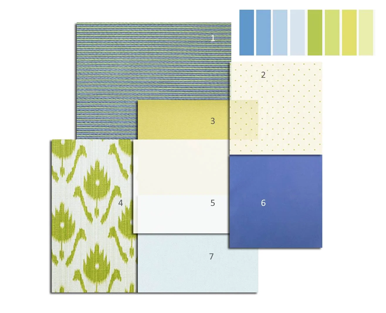
PALETTE TRENDS: Blue & Lemon Green

A soft, airy and placid combination is today’s fabric palette. It is hard not to like blue it is also hard to ignore as it surrounds us in our every day life. Blue is perceived as a color of stability, in light shades as having a calming effect. Using different textures in blue creates an interesting yet peaceful variation. Compensating the excitement that light-blue lacks, lemon green accents add rhythm to the palette. Although our example is a soft version of yellow-green it is a very vibrant color, literally! As experts say it reflects more light than other bright colors producing a stronger vibration. It is uplifting and promotes creativity but may border on being fatiguing or over stimulating. But no need to fret; simply use lighter shades on large areas reserving the stronger versions of it for accents. In a large room a sofa may be an accent piece much like a throw pillow in a smaller room. Knowing the implications of color helps us create rooms that are uncommon, pleasant and beautifully combined. In short this palette marries two opposite color personalities to create a complete environment. Below are designs that embrace using such stimulating color with confidence. Bravo!

  1. CLEMENCE, COBALT-LETTICE /HILL BROWN
  2. CARREG, LIME-CREAM / SANDERSON
  3. SOFA ANIS / PIERRE FREY
  4. PATOLA, CITRON / HILL BROWN
  5. MEPHISTO, BLANC /CREATIONS METAPHORES
  6. COMO, COMO /D.G. OSBORNE & LIITTLE
  7. CALLAS, 15 /CREATION BAUMANN

Fabrics by Daniel Fragata /design intern

Text by Andrea Chery /design associate

PALETTE TRENDS: DEEP BLUE SEA

Deep blue sea …is a very dark color, but it has an exceptional richness that encompasses power, abundance, strength, and the imposing presence of royalty. Its deep character yields a fine contrast with any light crystal color such as sea foam, mint green, aquamarine. In this palette we have a deep blue velvet (#1) as the main fabric, its embossed floral pattern adds a subtle elegance to the already shimmery hand of velvet. Such enigmatic fabric is perfect for a focal point piece, a sofa for example. Add a pop of color with silk pillows and juxtapose it with additional pieces upholstered in the color family accents such as striped jade, light blue, aqua and sand. We added a large printed silk (#3) for curtains to continue the drama to the walls, it has a light background so it won’t be visually bulky, it brings rhythm by braking away the rigid stripes. It introduces a little vibrant rose to the composition for contrast. Compliment it further with a kidney pillow or an accessory in a rose tone. The contrasts and the rhythm between the patterns is gauged to deliver a brave yet welcoming space whether it’s a living room or a more intimate space.

Below you will find some examples of courageous design using dark blue as the center of their color scheme. The first image is the Blue Room in the White House as it was around 1903 during President Teddy Roosevelt’s administration. The second image is a daring kitchen showcasing a contemporary dark blue with deep earth tones and contrasting white solids.

  1. PEONIS, 50 /JAB
  2. BACKSTAGE, MINERAL / KRAVET
  3. LE CABINET CURIOSITES, ROSE /MANUEL CANOVAS
  4. JULES, PIVOINE /MANUEL CANOVAS
  5. ENGLISH BURI WOOD FINISH /NANCY CORZINE
  6. QUEENS, SPRINGFIELD /SHYAM AHUJA
  7. ILLUSION, PARIS BLUE /GREAT PLAINS HH
  8. SOIREE, MIDORI /GREA PLAINS HH
  9. MARIN, NATTIER /MANUEL CANOVAS
  10. NATURAL OAK WOOD
  11. ROYAL FLUSH, BLUE CHIP /GREAT PLAINS HH

Reference;

http://www.whitehousemuseum.org/floor1/blue-room-history.htm

http://www.cococozy.com/2010/12/color-watch-dark-rooms-pitch-black-and.html