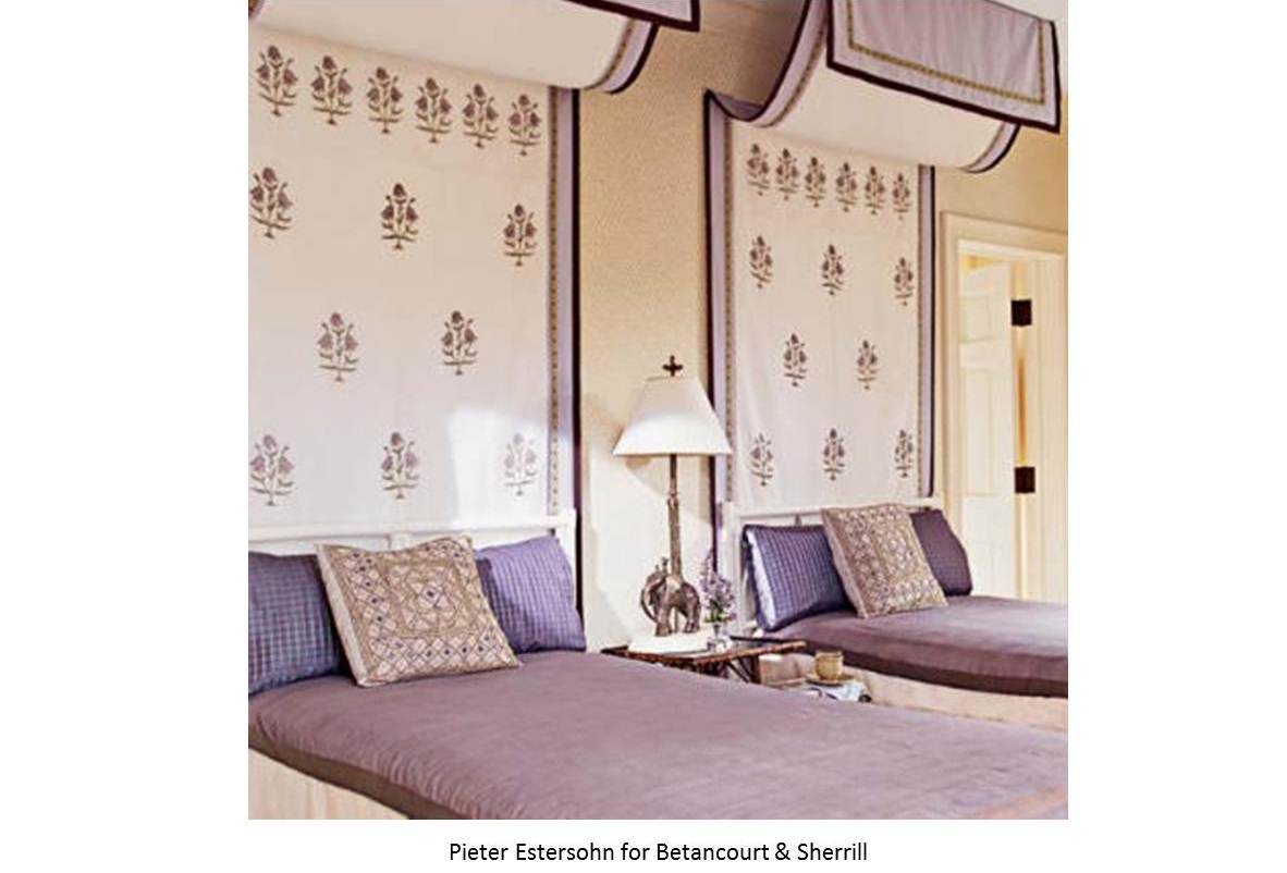
Our last Palette Trends post featured Eastern Orange. This month’s lavender affair goes hand in hand with the spring season. Lavender is in the family of purple, which is a color that represents royalty, spirituality and sometimes is associated with serenity, according to the psychological meaning of colors it depends on the undertone of the purple shade. As a mixture of red and blue, when the red undertone in purple is stronger it is said to be more stimulating whereas, a calming quality is more evident when the blue is the strongest undertone. Lavender the flower, is in the blue shades of purple and paired with other calming colors as yellow, lemon shades of green and earth tones it creates an interesting but soothing palette. The following examples are perfect for a welcoming guestroom.

- URBAN- LIME GREEN /LARSEN
- CHEVRON 501 /CHRISTIAN FISHBACHER
- ECHELON – OPIUM LAVENDER /JEFFREY MICHAELS
- BERMUDA HEMP – LAVENDER WALL PAPER /PHILLIP JEFFRIES
- TAKE DIRECTION – BRITANNIA /GP /HOLLY HUNT
- COBALT 113 /CHRISTIAN FISHBACHER
- CUSTOM WOOD FINISH
- CALLIGRAPHY – RICE CAKE /BRENTANO
- RITZ – LAVENDER /ARABEL
- PORTOBELLO – LEDBURY /DESIGNERS GUILD
- JUNKO – MAUVE /MANUEL CANOVAS
- CHICAGO – TILLEUL /MANUEL CANOVAS