Displaying Art

Displaying artwork in a way that is visually enticing while seemingly enhancing the overall scheme of an interior can create a challenge. When choosing what type of art should be showcased, let the artwork speak for itself. When designing a space, I tend to select artwork after the interior is completed so I’m not influenced by the color pallet of the piece. Although,  if one has in their collection a special piece they want to use, the colours of the art can be utilized to help unify the space and create a visually balanced composition.

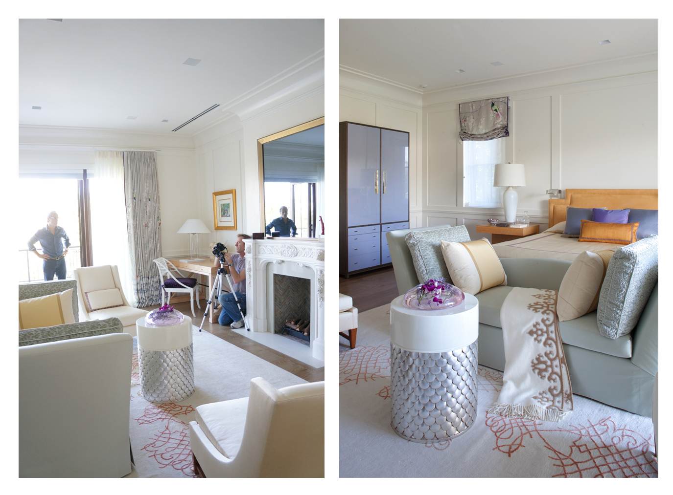
In this featured living area, a wall panel is displayed like a beautiful backdrop for two native sculptures placed above the mantel. Using a traditional decorative frame and Venetian stucco on the panel, the artwork stands out creating a bold display. To balance the room, a stunning midnight blue painting was selected, anchoring the sitting area. Taking inspiration from our client’s passions is helpful in creating a space that they will love. For this open and airy bathroom interior we actually had another piece in mind to be hung above the bathtub, only after learning of the clients love of crocodiles did we decide to select this subtle interpretation. It’s a perfect addition as it merges effortlessly with the overall color scheme. As for the bedroom (right), we inserted a pair of elegant bronze plaques with Indian Sanskrit. They each become a strong focal point when entering the room.

The above painting by Markus Oehlen was a last minute addition to this living area. It may seem as if the room was decorated around it or that the painting was personalized, but it was in fact a later addition that seemingly could not have made a better fit.

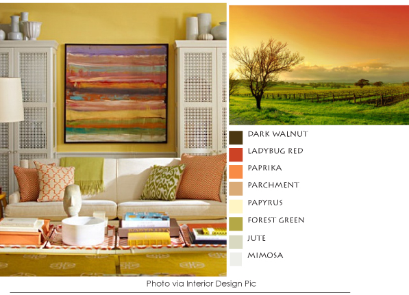
In the dining room above, as opposed to the previous image, the artwork was the first item I acquired for the client and in many ways set the theme for the room. In the design the showpiece was placed on the wall opposite to the window creating a counter focal point. Tying in the chosen color palette, the entire color scheme visually flows as the hues are effectively repeated throughout.

Sometimes less is more, crisp white walls make the perfect backdrop to a focal piece that might otherwise be overlooked. Highlighting the image with direct lighting will keep the frame from fading in the shadows. Typically, each piece should be hung around 60-66 inches from the floor or the average person’s eye level, but then again it really depends on what type of art is being displayed and the overall composition.

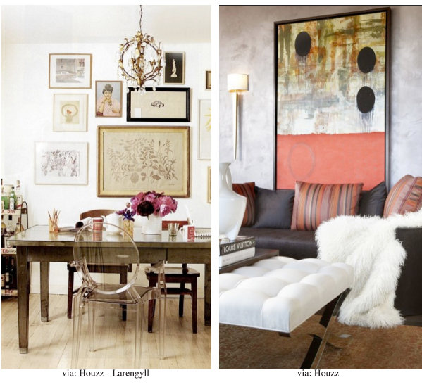
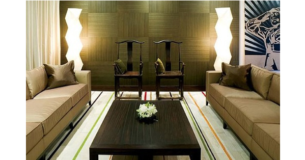
Large scaled works will create an immediate focal point and should be placed on walls where they can be seen and enjoyed. Smaller pieces, such as family photos, often work well grouped together in a gallery type setting. They may be placed in similar mattings and frames to make for a stronger visual and cohesive arrangement.

Barbie a la spiaggia

I found this to be so cool while on holiday that I thought I would share it with all of you design conscious people who read our interior design blog. Check out what Barbie and her clan did on their vacation in Italy. The paparazzo of French magazine IDEAT surprised them on the beach of Rimini and this is what he gathered.

(Ken contemplating the waves in a Ruban de Pierre Paulin chair (Artifort, 1966)

Barbie & her friends prefer the softness of the hot sand and a chaise lounge Don’do by Jean-Marie Massaud  (Poltrona Frau) accessorized with Eames  Elephant table (Vitra)

9:00am, workout on the beach. Everyone prepares for another day in the sun “farniente” style

- Barbie’s maternal instinct takes over as she hangs her clothes to dry.
  Vegtable chair by Freres Bouroullec (Vitra, 2009)
- Eames chair in case Ken needs a rest
- Showing their lovely legs on the hood of a pink cinque cento and lounging on the
  Marshmallow Sofa by George Nelson (Vitra, 1956)

Her vichy dress, now dry, Barbie rocks on the RAR chair by Eames (Vitra, 1948), Ken looking cool with his Piaggio Vespa, so Italian!

Settling down for the evening, it’s time to clean up...

- Ken stacks the slick chairs by Philippe Stark (Xo, 2000) and the Panton chairs by
  Verner Panton (Vitra, 1960)
- Dressed to kill a cool looking dude tries to eye up Barbie laying on the lounge chair by
  Eames (Vitra, 1956)
-  Not so fast! Last dip before the day is out. Cone chair by Verner Panton (Vitra, 19958)

The party still goes on. Beach party decor; sand, fire, music and Tom Vac chairs by Ron Arad (Vitra, 1999)

DESIGNER'S PICK OF THE MONTH: Mitsuaki Sora

Today’s “Designer Pick” features a vibrant collection of abstract woodblock prints pieced together by sculptor and artist Mitsuaki Sora. Born in Hiroshima in 1933, this assortment has become world renowned for its defining use of bold colors, graphic patterns and organic shapes. Sora’s works were featured in both the 1998 and 2008 Olympics and can be seen throughout many hotels in Japan. I was first introduced to the collection while visiting a friend in Miami and I simply fell in love with his work. These prints are very expressive, like contrary forces the shapes are interconnected and interdependent, almost dancing to the tunes of yin-yang. Simplicity, “less is more” and yet so expressive.

The Art of Caning

The art of caning is regaining momentum in the design industry. It has evolved into an art form that is no longer just associated with traditional design, but also embodies a modern edge. Caning is the method of weaving furniture out of a wicker material that is most often derived from cane. As a skillful tradition that originated in Asia, it was brought to Europe during the 17th century and quickly became popular for being lightweight and durable.

Caned pieces are available in an array of styles, the selection often relies heavily on the type of quality one wishes their piece to posses. French caning is one of the more intricate designs and it tends to have a lifespan twenty years longer than those that are machine made.  French caned pieces are designed in a way that allows each individual strand of cane to be secured with glue so that the end result is clean and smooth. Since the reign of Louis XV, these masterfully constructed furnishings have come to be cherished as great additions in many refined homes and modern day interiors.

The art of caning is often placed in the category of being traditional and classically styled. However, Phillipe Bestenheider and Robert Lighton are just a few of the designers that are working to give a new bold and exquisitely styled look to caned pieces.  The Lui5 Arm Chair (as seen above) is truly a beauty.  It boasts a wooden frame with hand-woven caning and when placed in any room would certainly stand out as a statement piece. Combining a mixture of patterns, lines, textures and materials to create collections that are overflowing with character; the finished furnishings are graceful and stylishly re-defined. With the development of machine caning many of these pieces are more accessible than ever with a great variety of designs to choose from.

PALETTE TRENDS: Burgundy

Today we bring you the color of wine, of Tuscan sunsets, and of unique fashion. Burgundy, plum, aubergine, whatever you relate this colour to it talks of a rich, aromatic, unrelenting essence. That’s why we are paying careful attention to the composition of this palette. At first burgundy is inoffensive, but when decorating a whole room with it it’s important to understand the properties of the colour; made up mainly of red, it is consequently associated with strength and empowerment. Interestingly aqua and green are also found in it which in my opinion suggests softer elements like water. In this composition we take advantage of those hidden colors that make up burgundy to create a familiar atmosphere, ensuring that the color won’t feel too strong or too dark. The printed fabric ties in all the colors, a solid ice blue cools down the temperature and a little bit of yellow-green brightens up the color-scheme. Be careful though, too much of a complimentary colour may result in a look as strident as a neon sign. So go on be courageous and use it in décor, fashion, even hair! You’re guaranteed to be distinctive and edgy yet well put together.

  1. MARRAKESH, GRAPE/ HOLLY HUNT
  2. VENETIAN GLASS, ICY MIST/ HOLLY HUNT
  3. ILLUSION, GYPSY/ HOLLY HUNT
  4. PRIMA ALPACA, MULBERRY/ SANDRA JORDAN
  5. PRIMA ALPACA, DAFFODIL/ SANDRA JORDAN
  6. TANGIER, POWDER BLUE/ MOKUM
  7. PAST PERFECT, AVA GARDNER/ HOLLY HUNT
  8. PAST PERFECT, AVA GARDNER/ HOLLY HUNT
  9. ST. GERMAIN, PRUNE/ METAPHORES
Other Sources:
www.polyvore.com/boys_will_be_boys_hiding/set?id=11658832
Clutch/ Aubergine Eggplant Chartreuse Blue Magenta Painted Bloom from www.etsy.com
Lily and Lionel Jolie Blue Leopard Scarf From http://www.boutique1.com
Rockport Zana Fashion Sneakers - Women’s Grey/Aubergine

DESIGNER'S PICK: Kyle Bunting

This week’s “Designer’s Pick” showcases an exquisite rug collection by Kyle Bunting. Drawing inspiration from the beautiful views of Texas Hill Country where their business is located,  the striking assortment is constructed innovatively,  using hide as the sole medium in creating an array of stunning high-end luxurious rugs. The pieces, all of which can be tailored and uniquely styled to fit the specific needs of each client, are filled with rich texture, bold colors, stunning graphics and designs. Plush to the touch and showcasing an overall design that’s visually eye-catching, each rug sets the stage for a designer styled interior, immediately enhancing the spaces in which they reside.

Upholstery

As I set out to write this blog, sharing my knowledge of a trade that has long been diluted, I began looking back at the things I’d learned as an apprentice at the age of 18. Wow, it seems to have been so long ago and my, how the methods of upholstery have changed!

My story starts at the tail end of traditional upholstery, before foam took precedent, when the skill of such a humble craft was still in the hands of an artisan. During these times, hand sewing was still common and zippers weren’t often used on cushions filled with only feather and down, instead, I was taught how to slip stitch. As horsehair was easy to obtain at this time, it was commonly used to build up a seat with an edge created by a “blind stitch.” Using an eight-inch long needle and twine, a roll stitch was then created for the front lip of the seating, a task now overtaken by the use of man-made tack rolls.

During that time, eight-way hand tied coil springs were the foundation of beautifully built sofas and armchairs, as they were often framed with durable Alder wood that was crafted together with dowels and screws. This well designed form of upholstering gave the furnishings a longer life span, allowing them to withstand the test of time, to be passed down, sold off, or reused for many years to come.  Slowly, as new substitutes were introduced due to cost and fire regulations, horsehair was replaced by coco fiber, then rubberized hair and lastly foam.  These new methods of substitution served to completely revolutionize and commercialize the upholstery industry.

Having given a brief overview of what used to go into the building of a traditional piece of furniture, I’ve found that I’ve learned something new concerning the meaning of "Upholsterer". Having derived from the word Upholder, the trade was formed by a select few craftsmen dating as far back as 1360. After being officially incorporated by the Royal Charter in the times of Charles I in 1626, by cabinet makers, undertakers, soft furnishers, auctioneers and valuers was formed and given the right to search, seize, and even destroy defective upholstery. “Can you imagine?”

So perhaps the next time you decide to select a piece of furniture, ask yourself, what went into making it? Should you decide to recover an armchair or sofa, pay it respect with a wonderful fabric that will enhance your living space. Have fun putting together your décor as you can now be content in knowing that like me, you have gained a broader understanding about where you plunk your “derriere”!

Fresh off the press, Avanzato Design featured in Elle Décor’s magazine

1
1

As I love New York, I was deeply honored when asked by Elle Décor to give my professional opinion on a few classic and modern Lucite and Acrylic furnishings for the section called “Truth in Decorating”. Before I knew it, the process had begun I was off on a plane and landing in JFK.

As soon as I got settled into my room, I found myself venturing out onto the sunny streets, absorbing the natural energy that vibrates throughout the city. Every corner offered a new sight to see, a variety of faces and vast cultural diversity.  I set off taking a walk to High Line, a public park built on a historic rail line above the streets in Manhattan that starts by the Meatpacking district and ends at West 34th street. It was indeed a worthwhile visit!

Early the next morning I was off to the studio. Once I arrived I met Quy Nguyen, an Elle Décor style editor, who later introduced me to Laura Kirar, a designer also selected by the magazine for her expertise in furniture and accessory design. Enjoying the company, I sat down to a beautiful breakfast spread that had been laid out for us. Standing close by, makeup artist and hair stylist Maysoon Faraj (below) waited patiently with her tools and brush ready to make me look 10 years younger and handsome.

It took at least three hours for us to give our opinions on each of the selected pieces, all the while, smiling for the camera, twisting, turning, standing and sitting to get the shot just right.  The photographer Bjorn Wallander, accompanied by his dog, was great to work with and extremely patient. Like in any art, perfection (if there is such a thing) is never complete until you have achieved it.

5.jpg

Click here to read more about the feature. Check out our previous design work with Elle Décor late last year.

Photo Shoot

This month we are taking an inside look at the preparation for our latest project scouting photo-shoot.

1- Living-Foyer
1- Living-Foyer

A part of completing a project of interior design is photographing our work, not only does it help us keep track of our finished product, it also serves as publicity whether it’s in our portfolio, advertisement or very importantly being published.

2- Library
2- Library
3- exterior
3- exterior

It also provides a different perspective of our work. Coming in contact with the space is usually a different experience than seeing composed images of it. It’s a final judgment on how we critique our work. As important it is for people to see our work through images, client satisfaction, efficacy or functionality is seldom taken into account. In order to show the public how we perceive our project it is necessary to take detail preparation prior.  We plan every shot when the room is “at its best” without it looking pretentious or staged, hoping we achieve a look of some ones every day to day lifestyle.  A few of the items we put on our list are things like extra pillows, a purse, wine bottles, napkins, soap or even make up for the vanity.

4- Dining
4- Dining
5- Master
5- Master
6- Robin
6- Robin
7- Design team
7- Design team

One detail we pay close attention to is the floral arrangements, stay tuned this month for a special feature on arrangements. As one can notice interior shots usually have amazing arrangements, some are fresh and colorful, some are subtle others are dry arrangements or even grassy ones but whatever they are they aim at bringing a little of the outside in. Especially today, we are socially geared towards an integration of the interior and the outdoors, no longer are we looking at perfectly ornamented, enclosed spaces with an intimidating refinement. The style of photographic approach has changed since we have become digital where one would employ strobe lights to enhance the environment of the interior while balancing the contrasting natural light. The approach we used in many magazines today and in this photo shoot is “straight” photography; it uses only natural light and a lot of photographic skill. What we accomplish is a more natural sunlit look, where the images show the true colour of fabrics and finishes.2011 architectural photographer of the yearrobinhill.photoshelter.comAs the nature of all of our blogs, we share purely informative material and our firm’s exclusive views and expertise.

PALETTE TRENDS: Lavender-Yellow

Our last Palette Trends post featured Eastern Orange. This month’s lavender affair goes hand in hand with the spring season. Lavender is in the family of purple, which is a color that represents royalty, spirituality and sometimes is associated with serenity, according to the psychological meaning of colors it depends on the undertone of the purple shade. As a mixture of red and blue, when the red undertone in purple is stronger it is said to be more stimulating whereas, a calming quality is more evident when the blue is the strongest undertone. Lavender the flower, is in the blue shades of purple and paired with other calming colors as yellow, lemon shades of green and earth tones it creates an interesting but soothing palette. The following examples are perfect for a welcoming guestroom.

  1. URBAN- LIME GREEN /LARSEN
  2. CHEVRON 501 /CHRISTIAN FISHBACHER
  3. ECHELON – OPIUM LAVENDER /JEFFREY MICHAELS
  4. BERMUDA HEMP – LAVENDER  WALL PAPER /PHILLIP JEFFRIES
  5. TAKE DIRECTION – BRITANNIA /GP /HOLLY HUNT
  6. COBALT 113 /CHRISTIAN FISHBACHER
  7. CUSTOM WOOD FINISH
  8. CALLIGRAPHY – RICE CAKE /BRENTANO
  9. RITZ – LAVENDER /ARABEL
  10. PORTOBELLO – LEDBURY /DESIGNERS GUILD
  11. JUNKO – MAUVE /MANUEL CANOVAS
  12. CHICAGO – TILLEUL /MANUEL CANOVAS

DESIGNER'S PICK OF THE MONTH: Alexander Calder

Today’s “Designer Pick” showcases the works of innovative artist and sculptor Alexander Calder. As a highly respected and influential artist of the twentieth century, the creative designer is most known for his works that push the boundaries of abstract art, creating pieces that are visually bold and characteristically direct. Growing up as the son of two artistic parents who were also known for their sculptural designs, Alexander was inclined to the arts as a child, creating two of his first sculptures at the age of eight. During a trip to Paris, Alexander became intrigued with the art of abstraction after having visited the studio of Piet Mondrian.  This influential event spurred his endeavor into the world of abstract art from which these visually inspiring lithographs derived. All signed and dated by the artist himself, the featured images below are a few of the pieces from his extensive collection. Each would make a great addition to any proud collector.

Read about some limited edition bronze studies featured in our Designer Pick of The Month posted in February.

Home Libraries

Express your love of books by creating a special area where you can read and house your collection. There are three crucial components to keep in mind when designing a functional library space; lighting, shelving and seating.  When properly installed, these elements can bring together the perfect reading room.  For an added decorative touch, try intermingling shelves with decorative items such as photographs and "objets".

There are a variety of shelving units available, the key is choosing the appropriate piece that will suit both the space and the size of your collection. Incorporate them into your decorative scheme to create the perfect backdrop in your living space. In this dining area, a beautiful shelving display compliments the decor while adding an element of architecture and beauty. Built-in shelves allow for a custom floor-to-ceiling bookcase. They can be created and tucked in areas (such as under the staircase) to make use of what might otherwise be considered “dead space.” Free-standing shelves are great alternative, as they make for a less permanent solution.When considering the types of furnishings to include, keep in mind how you ultimately want to use the space.  Your furniture selections should rely heavily on function.  Comfortable sofas and deep lounge chairs might not be ideal in a library space as they may cause you to want to sleep more than read. Your furnishings should be plush enough to allow you to sit comfortably for hours while rigid enough to entice you to stay alert. Here are a few great seating selections for a library.

Lighting, whether natural or artificial, is one of the most important elements in a reading space. Poor lighting can cause headaches and eyestrain. The perfect balance between natural and artificial lighting is ideal in a library space. When installing a reading lamp, the lighting should be placed over your shoulder to prevent it from shining directly in your eyes and to minimize glare. Indirect lighting also makes for a great solution in providing an overall lighting source, incorporating LED lights into your casework is a great way to showcase your collection.

PALETTE TRENDS: Eastern Orange

Orange photo 1
Orange photo 1

Intricate & naturally put together patterns give this scheme a subtle Eastern feel. Today’s rich color palette is a juicy tetrad,  which is composed of two sets of complimentary colors (opposite colors in the color wheel). The two complimentary sets have to be next to each other, in this case the first set is orange/blue displayed in the focal fabrics of this palette. To offset this bright color combination we use the second set in toned-down colors to ground the color scheme; the burnt-yellow/violet combo can be found on the natural tones of wood, trim details and subdued fabric patterns. We love this inspiration palette because it can evolve into a contemporary room with cultural appeal or a fresh take on ethnic décor.

Orange photo 2
Orange photo 2
  1. OMEGA / BERGAMO
  2. CALLIGRAPHY /BRENTANO
  3. ADARA -PERA / OSBORNE & LITTLE
  4. HANOI -TERRACOTTA / JEFFREY MICHAEL'S
  5. TOSCANA -GLACIER BLUE / HOLLY HUNT LEATHER
  6. GP STRATUS -WHITE / HOLLY HUNT
  7. WALL COVERING / 3M
  8. CABLE KNIT / BRENTATO
  9. CUSTOM FUMED HARDWOOD PLANK

DESIGNER'S PICK OF THE MONTH: Bronzes

This week’s “Designer’s Pick” features limited edition bronze studies by various exceptional artists. After spotting one of the originals entitle “flower” by Joan Miro during a project installation in Caracas, Venezuela, I grew intrigued with the piece reminiscent of my travels to Latin America where I was introduced to such rich cultures as the Mayan and the Inca’s in Peru. It was Miro’s Flower that reminded me of the Inca’s god “Papa Sol”. I acquired many of these studies through auctions increasing my knowledge and inventory of bronzes. Functioning both as art and beautiful “objets” these artistically sculpted studies make a great addition to anyone’s collection.

Koi Ponds

Koi fish, so bold in color, create spectacular ornaments in outdoor ponds. Having started the process of creating my own garden pond, I happened across these mesmerizing creatures at home in an array of stunningly beautiful habitats, simply ornamented and overflowing with lush greenery. These gorgeous gardens, so calm and serene, can take one far from the stress of everyday life.  Though it’s safe to say that a Koi pond requires slightly more effort to maintain than your average water garden, the benefits of housing such a spectacular feature is worth the added work.

Take a look at these breathtaking backdrops. Designed by Redland Koi and Pond www.redland-koi.com, a company that I have worked with on past projects, these Koi gardens would create a stunning visual in any garden. There is a lot that goes into the design process of masterfully forging together a Koi garden with it’s environment to make it appear as though its been apart of the surrounding landscape for years.  When it comes to creating a healthy habitat, size and placement are very important. Koi fish can grow up to forty pounds and shouldn’t be placed in a feature less than thirty-six inches deep. The pond should also be located out of the way of direct sunlight. This can be done creatively with the incorporation of trees and shrubbery.

The impressively striking visuals brought about by Koi fish can be accredited to their colorful outer layer. By introducing a variety of Koi fish into a pond, it creates a beautiful scheme brought out by a mixture of colors. The Kohaku, Shusui, Utsuri, Ogon, and Tancho are just a few of the kinds of Koi available with the Kohaku (a white Koi with red markings) being the most common variety.

Create little seating areas inside the garden and take full advantage of the surrounding tranquil and serene environment. When it comes to furnishings and accessories, simplicity is key. Use nature as inspiration for color choices and finishes. Wood is a great selection as it seems to blend seamlessly with little effort.

PALETTE TRENDS: January Greys

This month we are starting our palette trend blog. Every month we put together fabrics, paint or surface coverings to facilitate a color composition using our favorite picks and the latest fabrics the design trade has to offer.

This composition is made of predominantly grey fabrics. For a home décor we steer away from the dull with high contrast fabric patterns, warm beiges and organic wood grain wall paper, a touch of burgundy gives a neutral palette a splash of color achieving a rich and delicate look.

  1. WOOD GRAIN WALL PAPER / PHILLIP JEFFRIES LTD
  2. STELLA, GUNMETAL / LARSEN
  3. PALERMO, TAUPE / MANUEL CANOVAS
  4. GISSEY, PLAIN / SCALAMNDRE
  5. CASERTA FLORAL, JACQUARD / SCALAMANDRE
  6. GISSEY, TEXTURE / SCALAMNDRE
  7. STODDARD, MEMORIES OF A VOYAGE TO INDIA / SCALAMANDRE
  8. BOMBAY LACE, MEMORIES OF A VOYAGE TO INDIA / SCALAMNDRE
  9. UPCOUNTRY, STRIAE VELVET / SCALAMANDRE

DESIGNER'S PICK - Patrick Nagar

Today’s “Designer Pick” features a chair that is simply stunning. Artistically crafted with a shape that’s stylishly modern, this wooden chair designed by architect, artist and designer Patrick Nagar for the Ralph Pucci International collection was created to be simplistically sleek while maintaining a stylishly stunning presence.  Bearing a neutral shade, it will seemingly mesh well with almost any color scheme and would make a great addition to any modern home. Its creative form stands out more as an artistic element than simply a chair. He mixes traditional materials with modern designs to create pieces that tell a story.

Below are featured a few of the pieces found on Patrick Nagar’s online collection that are just as visually striking and impressively designed.

Color Scheme

With the introduction of color, even the most mundane space can be transformed into a place of beauty. But how do you fuse together a color palette that will suit you and your décor?  If you’re hesitant about introducing color to your space and find yourself a little unsure of exactly which direction to proceed in, just turn to nature for inspiration. She puts together the most beautiful schemes and effortlessly weaves together the most intricate colors to create the most breathtaking backdrops. You can’t go wrong by following in her footsteps. A cool emerald blue contrasted by a radiant tangerine has meshed to create the perfect pair in this relaxing living space. The soothing color scheme was interjected with just enough color to create a place of interest without being overwhelming. Understanding this perfect balance is key when choosing colors for your own space.

In this beautiful dining space, chairs outfitted in a deep rose fabric pair well together in an otherwise neutral arrangement.  Neutrals have the ability to compliment almost any scheme. When coupled with brighter colors, they make for the perfect backdrop by creating a grounding element.

Reminiscent of a country-side sunset, this charming little arrangement makes for the perfect cozy and comfortable sitting area. When you have a color scheme that incorporates a wide array of colors, you have to find a way to bring them all together. Adding a painting, or even more simply an arrangement of pillows, can help to merge your color scheme together.

Thinking about redesigning your outdoor area? Earth tones intermingled with a few colorful accents is the way to go. Keeping your outdoor color palette muted will only enhance the colors in the surrounding scenic view. To keep the arrangement from looking underwhelming, incorporate different textures and patterns to create an area of interest.

Cool colors create the ideal ambiance in modern spaces. In this lightly saturated modern living space, two colors were used throughout in variations. The end result is a well put together collection of colors, patterns, and textures.

Some might choose to forgo adding color to their walls. You can instead interject color into yours space through the furnishings and accessories. Layering is important, it can add depth and dimension to any bland and uninspiring space.

Whether it reminds you of a soothing trip to the beach or a quiet storm, these beautiful Athenian blues and French Horn neutrals set the stage for a relaxing retreat like environment. A patterned rug, accompanied with stylish pillows and matching artwork create the classic stylized living space.

This dreamy bedroom arrangement effectively incorporates a blend of bright lilacs, wild orchid purples, and Santa Fe oranges for the perfect women’s retreat. Crisp white furnishings enhance the colors intensity, where as darker furnishings may have taken away their luster.

Elle Decor Designer Showhouse - Part II

The process has been a whirlwind,  and after spending countless nights designing,  constructing, installing and applying those small designer touches, the end result is a scene that could entice even the most indoor individual to want to spend more time outdoors.

Throughout the development, we were faced with many design challenges, the first being how to deliver the selected furniture pieces to the condo. We quickly found there was no straight route from the parking garage up to the 43rd floor. Instead, we were forced to park on one side of the building, after which we had to take an elevator downstairs, proceed to walk our way to the other side of the building, and finally take another elevator up to the penthouse.

The given terrace was open and airy, bearing very few walls, the layout became a challenge when trying to anchor the design. We wanted to create a familiar space that guests could comfortably lounge, entertain and dine in. We decided to build our own creative space. Using white curtains with hand painted orange borders, we defined our outdoor area with implied walls of fabric. Our first attempt failed as the high winds ripped the fabric. Deciding to weigh them down the sec­ond time around, the space was paired with tall chairs and tall sofas, evolving into an intimate lounge for refined entertaining. We overcame some lighting difficulties as well; having no accessible outlets, we skillfully hid conduit that allowed us to ef­fectively light the area. We installed large-scale lanterns and had them hung over the dining tables. Soft lighting captured by the floor lamps and candle lit lanterns evoked a seemingly timeless classic beauty and glow.

The custom bar, which was the result of a collaborative effort between designer and green artist, held directly overhead the Plexiglas screen on which all-time favorite movies were displayed. Along with the wind, the heat and humid­ity was also shown to be a problem. After being hung, the first projector actually blew up. Thanks to our A/V, it was quickly replaced and the movie showings could continue. The amount of help that the vendors provided, whether it was staying late to correct problems of installation and troubleshooting or orchestrating hectic deliveries the day before the photo shoot, was unprecedented.

In the end, the project was a huge success. The Elle Décor preview party turned out over 500+ guests that included such names as actress Jane Seymour as well as Elle Décor editor in chief Michael Boodro. Thanks to the well thought out symmetrical floor plan, even with a packed house, the guests could easily maneuver and navigate their way throughout the space. Stylish and inviting, the decor set the mood for the many events. Every piece in our space was an indispensable element that complemented each other and brought the design together into an articulate and vibrant composition.

Read how it all started in our last post: Elle Decor Designer Showhouse - Part I .

Elle Decor Designer Showhouse - Part I

The highly anticipated Elle Décor designer showhouse is here and we are thrilled to see its doors open along with Art Basel Miami. This year we were selected among seven other designers to transform the penthouse atop the newly built Paramount Bay tower located in Downtown Miami. Our challenge was to transform a standard terrace into a breathtaking outdoor heaven; we were given a narrative of a fictitious client and a blank canvas featuring spectacular panoramic views overlooking Miami. To reflect the lifestyle of a lively couple known for their love of music, the arts and their world travels, we used organic and exclusive elements as the inspiration behind the design. As we started the process of sketching out ideas, the space slowly began to evolve into this modern outdoor dining and entertaining area suited for their lifestyle and enriched with refreshingly bright colors, clean lined furniture and stylish accents. The end result is a stunning outdoor space that is as equally impressive as the surrounding city views.

Several pieces are custom designed for the space such as a console and the dining tables, artfully constructed and made from driftwood, they immediately grab your attention as you walk onto the terrace. The items bring about an effortless element of beauty and make a great contrast to the modern décor. As collectors of fine art, the lively couple will be able to both recognize and appreciate the artistic and sculptural nature that is brought out by each of the originally designed pieces. The bar is made of an exotic Alexis tree recuperated from the results of hurricane Wilma and a floor to ceiling Plexiglas TV screen juxtaposed by contemporary white woven barstools.

We decided to use a crisp white as the backdrop for the design and popped it with cool blues and tangerine oranges, bringing it all together with a few organic accessories. Our feature wall is a gorgeous reverse painted glass panel which was designed as a floral garden backdrop with hints of the colors used in the room. Lanterns hung as chandeliers gave the space an unexpected element of whimsy, other floor lanterns were placed freely throughout setting the mood. A uniquely styled custom designed orange and white console table, that was placed behind the seating area, simply gave the space another layer of personality and unexpected charm.

The design was a labor of love and as it unfolded, seemingly all the pieces came together. The hand picked pieces of furniture contrasted against the white walls like pieces of art. The chosen scheme reflected colors similar to those seen from the balcony into the cityscape. Intermingling a mixture of lounge chairs, dining seats and bar stools, the space is perfect for outdoor dining, relaxing and entertaining. Want to see how it all panned out?

The finished product was a total transformation, but to see it you’ll have to stay tuned!